5 Rules: The Science of Choosing a Font

Image Source: unsplash.com
When designers make font choices it is usually a very arbitrary decision with only one aspect taken into consideration. The question asked is: will the design be used online or for print purposes?
Since the majority of designers make use of two main font types (serif and sans serif with the difference between the fonts being: the serif has slight tails at the top and bottom of each character, while the sans serif is sleeker) a clear distinction has been made where designers prefer using serif in print and sans serif online.
However, there is no scientific basis for this selection, for research actually suggests that serif fonts like Times New Roman (made specifically for print use) are more easily read or scanned online. So if the implementation of font types online and offline is suggestively erroneous, shouldn’t designers give more thought to the font personalities when deciding to make use of them in their designs?
There is an obvious psychology attached to font choices and if we segment these choices, we can highlight gender, age and personality preferences using the results to create a more effective design campaign. The question designers may now ask is what font do men prefer and/or what font do women prefer?
This question is an oversimplification of a very complex subject. Font preferences vary according to age, and culture and even personality; to classify a font as ‘feminine’ or ‘masculine’ seems sexist in a way. So how do you make the art of choosing a font type more specific?
This article has been inspired by The Psychology of Fonts a study by Aric Sigmanand a book by Simon Garfield titled Just My Type, which gives fonts different personality traits. The psychology factor comes into play when Garfield claims that Comic Sans is for attention seekers (the more annoying ones), while Shelly represents fun loving and flirty personalities. Courier is for data crunchers and librarians, while Univers gives those seeking anonymity something to feel less insecure about. Crazy right?
Rule 1: Choose between serif or sans serif

A study of serif and sans serif fonts suggested that different fonts arouse a plethora of reactions in the reader. Apparently the font Times New Roman, is more amphibious in nature and changes its personality with the content being displayed. If the same humorous article is presented to readers in Times New Roman and Arial, more people connect ‘humor’ with the article written in Times New Roman. Though a font with no personality, it may prove to be an effective choice if the focus is more on what is being written as compared to the visual display of imagery. This dispels the preconceived notion designers have that Times is a dispirited font that should be avoided.
Another study presented in Scientific American suggests that readers are better able to scan the text when it is in serif fonts. The study also associated better comprehension with these serif fonts especially if displayed in an uncommon font size. The unscientific reasoning behind this could be that readers are forced to move out of their comfort zone and focus on something new, thus making the text content more memorable.
Choosing from the more geometric sans fonts like Helvetica and Gotham could mean the difference between choosing modernity and clarity (brain vs. brawn). They may look good but are not necessarily comfortable to read. Yet, considering the trend of minimalist design geometric sans fonts may be more appropriate than the humanist sans choices that are more detailed and a pale reflection of their sleeker counterparts. Verdana seems to be a corporate replica of its geometric counterpart, the Helvetica while the Gill Sans has been the butt of many a joke with the top one being:
Q: How do you do British post-war design?
A: Set it in Gill Sans and print it in British Racing Green.
Fonts like the infamous Comic Sans look deceivingly informal to clients outside the design industry, but readers actually perceive that as immaturity or insecurity-not the best basis of selling a business product or concept. Serif fonts are more conservative and appeal to the business corporations and solicitors, though Arial is considered more contemporary like the Helvetica, while Courier usually represents automation or discord…it is the font of preference for resignation letters!
Rule 2: Choose the usual or unusual font
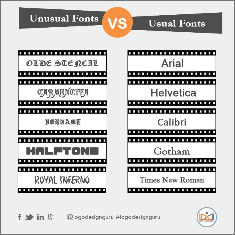
It has been proposed that using usual fonts like Arial clarifies the readers mind allowing them to take more action (aka. more sales) while clustery font like Scriptina can cause confusion and less action (hence no sales). This makes sense and that is why we see most websites using similar fonts. However, going by the previous notion of muscle memory those websites that use unusual font types stand out-for better or for worse. If it is for the better, then the readers ‘unused’ font memory is forced out of sync and the site becomes memorable and thus, effective. If it is for the worse-then the website stands out for less inspiring reasons.
So whatever the choice, make the decision carefully. Transitional and modern styles of font are sharp and edgy but Baskerville, a prototypical transitional font is sharp but can’t be used to read long portions of text. It would work well as a headline feature alone.
Then the duo Bodoni and Didot combine the thick and thin modern strokes and create something that is neither really outstanding nor very modern (even the transitional Times New Roman overshadows them). The old style typefaces called ‘venetian’ are calligraphic in form and create a contrast to the modern design styles with the Garamondbeing a good example…it’s just classic (read bland). So if the text is to be neutral in tone-Garamond is your font.
Before deciding to create a website in a radically different font type there is conversely, a contradictory report that suggests if fonts are too diffluent, the reader is less able to comprehend the information.
Rule 3: Size does Matter
Size (font) does matter and plays a vital role in creating a perceptual image in the mind of the readers. Ever wonder why privacy policies and terms and conditions are written in ‘fine’ print or smaller size? Research suggests that large fonts are suggestive of immaturity and unprofessionalism while smaller fonts with minimalist tendencies evoke trust, dependability and feelings of legitimacy-hence the fine print.
The psychological reaction of the reader to the smaller font is that the text is more ‘legitimate’ or ‘formal’. Multiple font choices sometimes help create better context on a web page e.g. using font size 12 throughout the text content and then, at the end adding some notes in size 9 may cause readers to focus more on the smaller text. The point is to break up the content message while focusing the‘energy’ on the fine print.
Rule 4: Measure the effect on Gender
Rectilinear fonts are considered to have masculine appeal while more curvy and round fonts appeal to women. A BBC audio program some years ago did designate fine, serified and elegant fonts as being feminine while, blocky and bold fonts were personified as masculine. However, personally I feel there is a disparity in this idea for some women who work in highly competitive and traditionally male oriented industries (think construction and manual labor) would rather not be perceived as ‘soft’ and go against the notion of choosing ‘feminine fonts’. Thus, this sexist division could become less accurate and unsuccessful if applied without proper research into the type of audience being targeted.
As a marketer, I would suggest to any designer that unless the target audience of the corporation is very narrow, basing a font choice on gender may prove capricious.
Rule 5: Rock the Boat?
To really rock the boat of font choices go for the urban serif or slab serif which is solid, blocky, yet, sophisticated and sleek. It’s a master of vogue and considered a renegade, allowing perceptions to falter when combined with the right dimensions of choice. The heavier typefaces like Clarendon and Rockwell may be more authoritative than the Archer but they are both urban…sick is the word of choice to describe them. They are voracious and dynamic and can be dressed up or dressed down depending on the message you want to send to the reader.
Bottom Line
Psychologist Aric Sigman who did a study of the Psychology of Fonts wrote: “ Using the wrong font may give people the wrong impression about you and could affect decisions that will shape your future. ” Keep in mind then, that the typeface chosen to represent the business in terms of design will prove to be a significant factor of influence. Choose wisely for your choice will create lasting impressions on the reader.