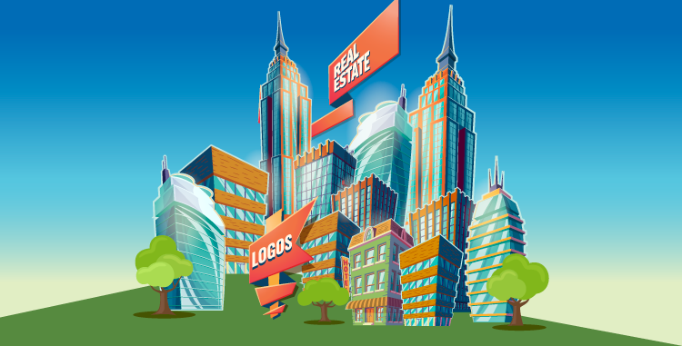
7 Secrets to Creating Amazing Real Estate Logos
Featured Image Source: Freepik/@vectorpocket
In all businesses, owners are becoming brand conscious in order to attract new customers. Today’s post is all about real estate logos. A logo tends to be the first thing potential customers link to a company’s name, thus it must be unique yet professional at the same time. How hard is this to achieve? We don’t think it’s hard at all!
Here is how you can create amazing real estate logos along with real estate logo inspirations:
1. Avoid Cliché Images and Symbols
Overused design concepts like building structures, roof tops and homes have been used by thousands of designers. Search for real estate logos and you will come across logos with such symbols. Avoid falling into this trap.
2. What other Symbols can be Used?
According to experts from HML, many people are tired of seeing the same repetitive views of rooftops and home structures daily. Smart logo designers are now using unique patterns to represent the real estate businesses. Geometric shapes like boxes, triangles, pyramids and Origami-style symbols make for a different approach while maintaining the meaning of real estate.

3. Learn to Think Different!
Think outside the box! The real estate business deals with houses and buildings, but you don’t have to necessarily just use these images. Think! What else can be used as a symbol for home? What other images can represent a house or give the feel of a home? I’m thinking… trees, picket fences, keys, locks, stone pillars… the images can be countless. It’s all up to you and your creativity!
4. Experiment with Typography
You don’t always have to add an image or a symbol in the logo, strong typography also works well. Use an abbreviation or initials of the business name and create a simple yet unique real estate logo. Just make sure what you use is professional and nothing childish that might give a non-serious look to your client’s business.
5. Usage of Colors
Real estate logos are not limited to colors. Unless your client has something specific in mind, feel free to play around with colors. However, make sure that the colors used give the business its true personality. Colors like blue, grey, silver, gold, black and brown are commonly used to represent professionalism. To show a trendy approach you can contrast these colors with red, orange, yellow and purple.

6. Represent the Company’s Personality
Even companies don’t want the same old images any more. They want something different that can hold the real meaning of their business. Before you try to make your client understand your ideas, do read and understand their requirements carefully. This is a must! There can be many real estate businesses, but each one will have a different specialty and personality. THAT is what you need to work in to your logo design.
7. Help your Clients Understand
Once you understand your client’s business and services, come up with your unique ideas and present them to the client. Don’t forget to explain your approach and how your concept represents their business. This will help to introduce your idea to the client. Ask for feedback and take it positively. The client might not always like your idea. However, they will appreciate the new approach and may become interested in what you have to offer once they understand it.
Real estate logos can represent the business by colors, symbols and typography. A good realtor logo graphic is one that represents the company and its trends.
We really hope that today’s post has helped you think differently about real estate logos and has given you a new perspective. What do you think makes a powerful real estate logo? What would you add to our list? Do give us your feedback.
Logos Source: LogoPond
Real Estate Logos
Mortgage Firm Logos
Realtor Logos
Mover Logos
Handling Service Logos
Transportation Company Logos