AirBnB-A Fiasco of Rebranding?
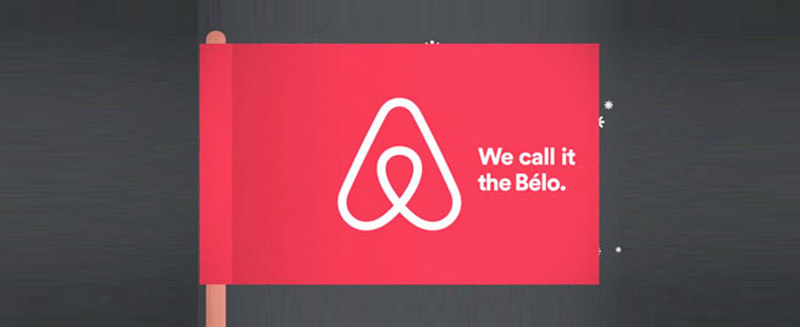
Image Source: airbnb.com
What happens when you create a plan, perceive success and yet, fail-dismally?
![]()
AirBnB, one of the best websites for short-term rentals, did just that-they launched with great anticipation their new logo and yet, it has in polite terms become a laughingstock. The audience is currently snickering about which part of human anatomy it resembles the most. Look at it one way it could be the female genitals and look at it another, it becomes the men’s private parts.Could it get any worse?
Now, while I doubt this will be actually damaging to the sales of the company, the question we have to ask is how did the company marketing team allow such a fiasco to be created?
My perspective is that AirBnB simply researched too little, and assumed too much. In the great jungle of public opinion (that is the Internet) the greatest strength of a new symbol is that its meaning should be constructed immediately. The mass audience should look at the image and be able to generally determine what the symbol represents and the company should have a ‘story’ to fill the audience so that their perspective and/or interpretation is further validated. This creates a connection between the brand and the consumer that is then hard to break.
AirBnB tried to create that connection but the lines drawn had too many different inferences to allow for success. They created the logo and then sent out a pictorial press release with the ‘story’ as can be seen below:
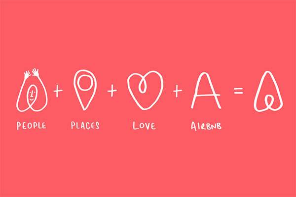
It’s a great concept. Really it is, however, people just don’t have the time to connect the dots. They won’t all see this press release to connote the relationship, they just don’t have time. So when Airbnb made the regrettable decision of getting philosophical they lost their audience.
Let me create an analogy here. The struggle of Jackson Pollock as a figure in artistic history is that for the viewing public there’s a point at which they just see splatters on a canvas. Similarly, when we see the AirBnb logo (without the above pictorial philosophical story) we in our trashiness, see the organs of the human genitalia.
Airbnb made the mistake of expecting entirely too much from their public. See, suspension of disbelief will allow for a lot of things, especially where meaning is involved. You can create the story, however, the image should have the same depiction of meaning across the board with no room for confusion. You cannot ask the audience for respect when your logo is so… comprehensively silly.
That is why every business must understand logo design is not only difficult work, it is serious work. There are a lot of things great designers have to consider which truly makes the difference between a brand and a logo. You can’t just create a logo and expect people to relate to it and understand the hidden symbolism-especially if it is so confusing.
Airbnb found out that it’s difficult to predict what people will think of your logo-unfortunately they found out the hard way. They could have avoided the fiasco getting multiple opinions, doing beta testing for the logo conducting blind testing for opinions. A lot of big brands have rushed into rebranding and lost their audience and consumer confidence so that they had to revert to their old logos.
Rebranding is not an option that is viable for every company, every business must first get consumer opinion and then decide whether rebranding is an option that would work for them.