5 Amazing Things To Learn About Automobile Logo Design From Renault-Nissan-Mitsubishi Alliance
To be quite honest, I am not into cars unless they’ve got super-exciting features or there’s something big going on down that road such as an alliance of three well-known automobile manufacturers. This is some news: Renault-Nissan merger grows to include Mitsubishi Motors and they’ve got a new threesome logo! Oh yeah, and it’s worth a look.
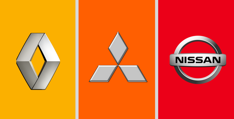
Image Source
Their Business Alliance Story
It all started in 1999 when Nissan and Renault decided to tie the knot but then what’s a relationship without a love triangle. Mitsubishi came into the picture on some common grounds such as a) launch of zero-emission electric cars by 2022, b) production of concept vehicles with new autonomy, and c) introduction of driverless robot cars. So it seems like a well-knit idea and to an extent the crisscross symbol does project their collaboration, what do you think?
While you make up your mind about this logo, let’s look at the awesome things we can learn from this design.
Warm Colors Don’t Need Cool Colors
Colors on the warmer side of the spectrum are radiant and they don’t need hues like blue to tone them down. Whoever told you to always mix-n-match simply forgot the splendor of a warm trio. While warm colors are confident, they also give a sense of comfort. Plus within the warm category, you can use the tints and shades of a particular hue to create visual interest and bring variety in design.

Image Source
Symbols Are More Responsive
Symbols in general responsive in two ways, if you may have noticed. First it is easier to put a symbol anywhere from your printed material to your website and mobile application. The best thing about symbols in automobile logos is that you can either use a mundane object or use an abstract shape to disseminate your message.


Minimalism Doesn’t Have To Be Boring
While many companies these days are resorting to monotone logo designs or just a name or simply an icon in black, minimalism doesn’t have be dull. You need to add some kind of charm in your logo design so that it connects with your target audience. If you’re not in the mood to use gradients to give a metallic sheen to your logo, then add more than one color.
Analogous Colors Create Harmony
Colors that are on the same side of the color wheel such as red, orange and yellow radiate a beautiful sense of comfort when they join hands together in a logo. While they each resonate different feelings, when they’re combined harmony is automatically created. For example red has a sultry, dangerous or bold personality but yellow and orange that’re about serenity, joy, anticipation and interest help create the balance.

Image Source
Overlapping Lines Give A Sense Of Depth
You can make a three-dimensional logo, add a bezel or a perspective to add a sense of depth in your logo design but if you don’t want to get all fancy you can simply overlap shapes. Yup, it is as simple as placing an object over another. In the Renault-Nissan-Mitsubishi logo, you can see how the lines look like they’re on different grounds that is back-ground, middle-ground and fore-ground.
Which Tip Sounds The Best To You?