13 College Websites That Hold A Record For Interactive User Experience

Feature Image Source: iStock.com/Lightcome
Gone are the days when prospectuses used to be the first access of the would-be students into any university or college. Today all thanks to the internet, people can get a virtual tour and the students can view all the updated information. Without visiting the college facility, the budding learners can easily get a glimpse of what life is like in different colleges.
Of course the user experience and functionality of the websites are the core attributes. While all educational websites focus on friendly navigation, they also face the challenge of organizing relevant information. A complicated web layout often compromises the user experience which is the last thing an educational institution would want.
An updated website representing any educational institution should also be responsive. Imagine the trouble that a viewer has to go through your content that gets illegible upon zooming. With interactive websites, all the stakeholders including prospective students, professors, student’s parents or the community, they would expect a visually pleasing experience. Is your educational website intuitive enough? Does it contain relevant call-to-actions? And how are they presented? Answering all these questions will make you optimize your website for an interactive and meaningful user experience. Let’s give you a tour of some websites that are interactive.
Rhode Island School of Design
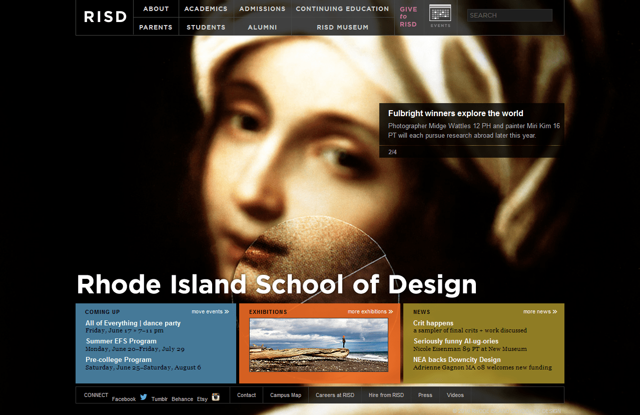
The website is designed over multiple-page layout that eliminates the need to scroll. They’ve used high definition images to support information segments. However, the thing that makes it truly valuable is easy navigation, and interactive panels but lacks a responsive layout. This means the website does not yet qualify for the Google’s algorithm awards for mobile friendly websites.
Johns Hopkins University
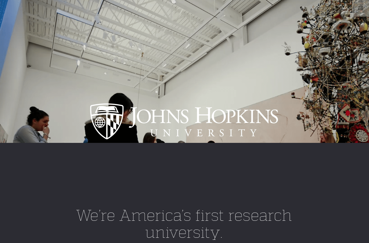
Johns Hopkins is the very first to set standards in terms of web layout, design and user-friendliness. The navigation is plain but provides exactly what the user is looking for. Interestingly, the logo fonts and the crest symbol of the university blends in nicely with the web design leaving nothing to the viewer’s imagination. The open book represents knowledge and discovery, the globe signifies the university’s worldwide reach and responsibility, and the crest of Lord Baltimore is emblematic of the university’s commitment and connection to its community.
Stonehill College
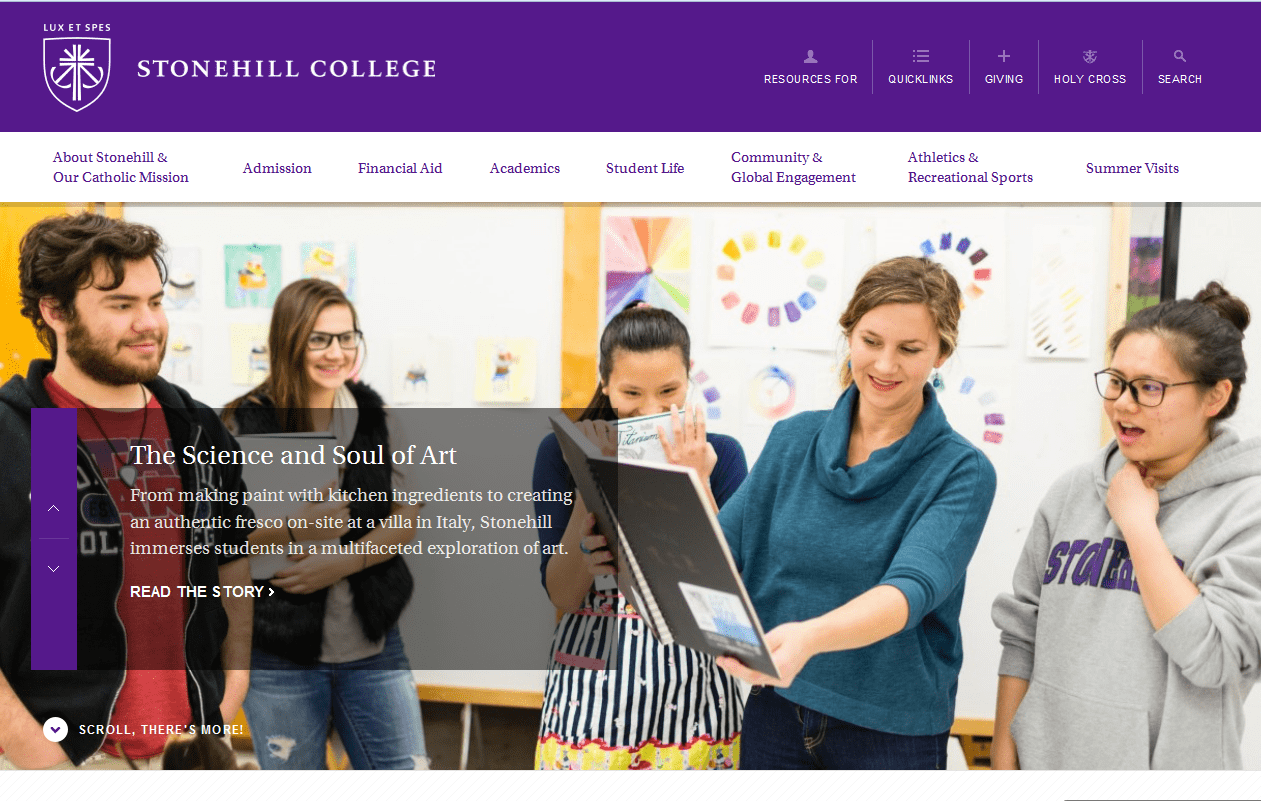
An excellent example of an educational website that is interactive and embraces negative space so that the information appears nicely organized. The navigation is simple which allows the basic information accessible from the top of the home page. The logo takes the left most corner at the top and the purple brand color makes everything stand out. It goes on to show that the design school is fully aware of the web optimization according to the needs of current user. Take a look!
University of Notre Dame
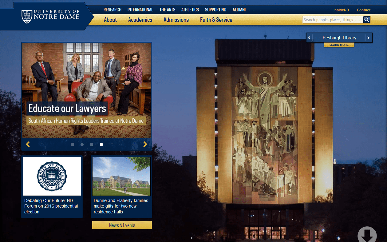
They operate on the web in a single page layout which is both interactive and responsive so that students can access it on mobile devices as well. The website allows all viewers to get a virtual tour of the campus and all the other relevant information on admissions, registration and more. The website was launched in 2012 by an in-house design team and their approach to design is explained by Philip Zastrow, the team’s web designer:
“We wanted to make the navigation as intuitive and simple as possible, in a lot of ways a homepage is a portal, but we want it to be a more experiential, informative portal.”
University of Nebraska Lincoln
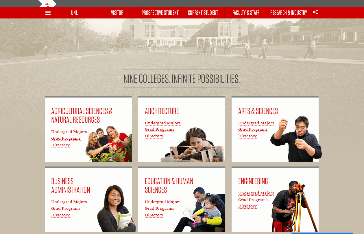
Although it’s not rare for university websites to make use of negative space, this one does it more elegantly. The web layout is interactive and intuitive and displays clear call-to-actions. Limiting user options might seem like a terrible idea but they focus on guiding the traffic to the relevant page.
University of Bradford

No use of parallax, fancy visual or videos to distract the user. Bradford University web layout makes it simple for the visitor to start their journey from the search query named “find a course”. The menu bar is neatly compiled in a dropdown menu on the left. The students can also search the university from the top right search query. Scroll down for videos and complete information. Now that’s what we call interactive!
University of Chicago
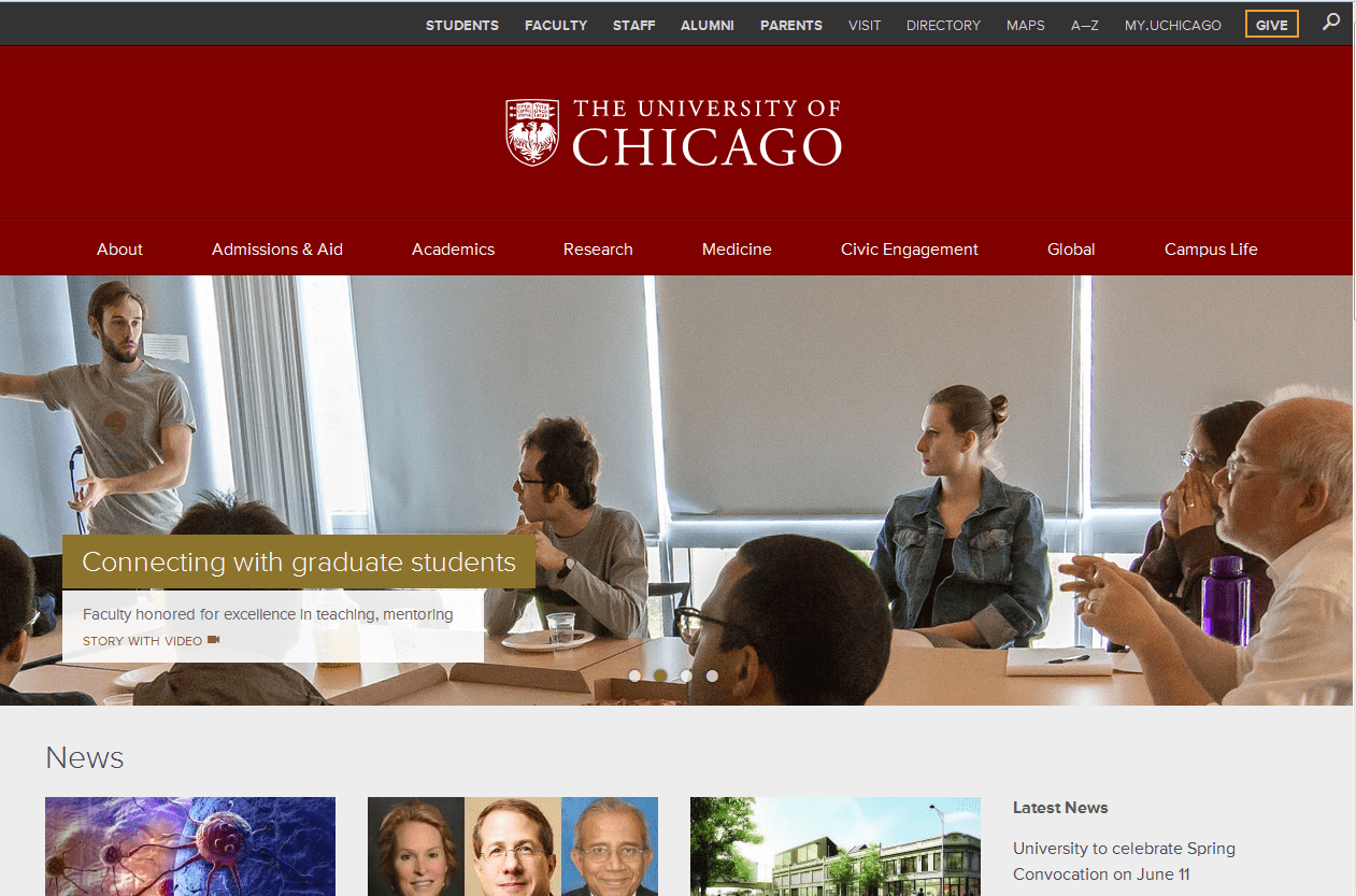
It is not one of those single-scroll-find-all websites. Their home page displays relevant categories in an elaborate navigation bar that takes the user to internal pages for more information. This makes the web design clutter-free and more easily accessible. All the events are listed and updated on the left hand side and you don’t have to scroll much to reach the footer.
Rocky Mountain College of Art and design
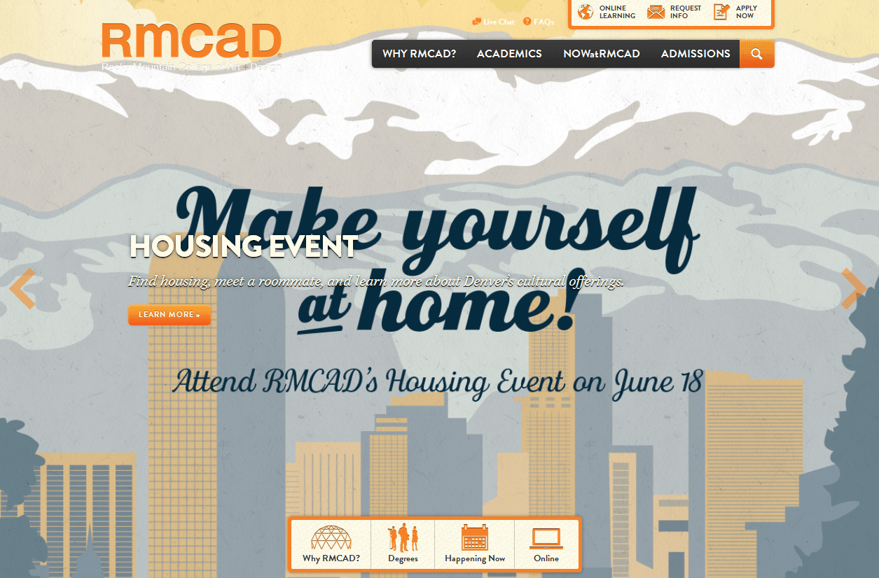
The new responsive website was launched in 2012. It displays attention grabbing, high quality images with minimal content. The visuals and effective navigation techniques add personality attributes to the design college. A Florida-based digital agency Purple, Rock, Scissors was given the responsibility to redesign this website and make it responsive without compromising on the visual aspect. On the downside, the website takes a little longer to load.
Belmont University
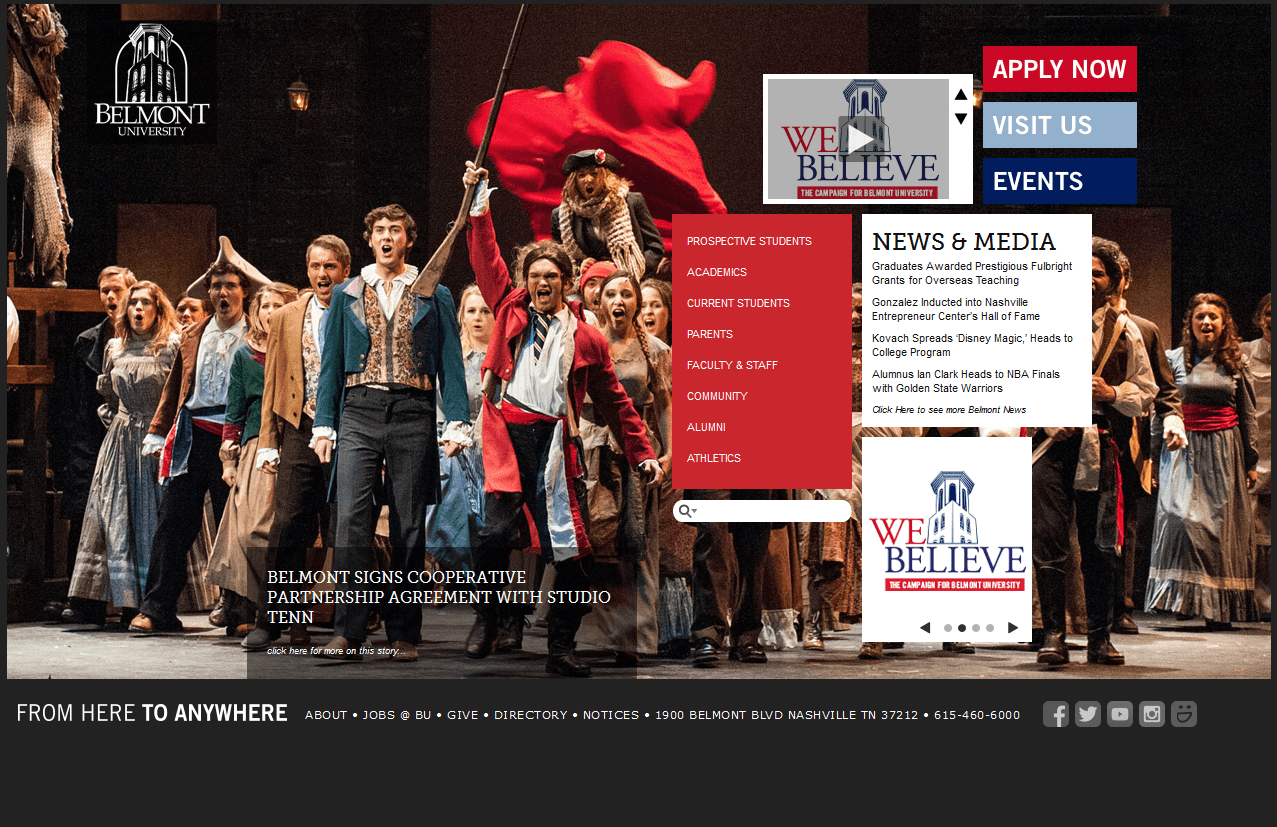
Belmont likes it simple so the website design greatly limits its use of visuals and text – just one image to explain it all. It’s true that university website is the portal to present all essential information but Belmont web layout shows how to do so without cramming every bit of information in a small space. The center of attention is the image and then the navigation panel which is not at the top unlike in conventional web layouts.
Drexel University
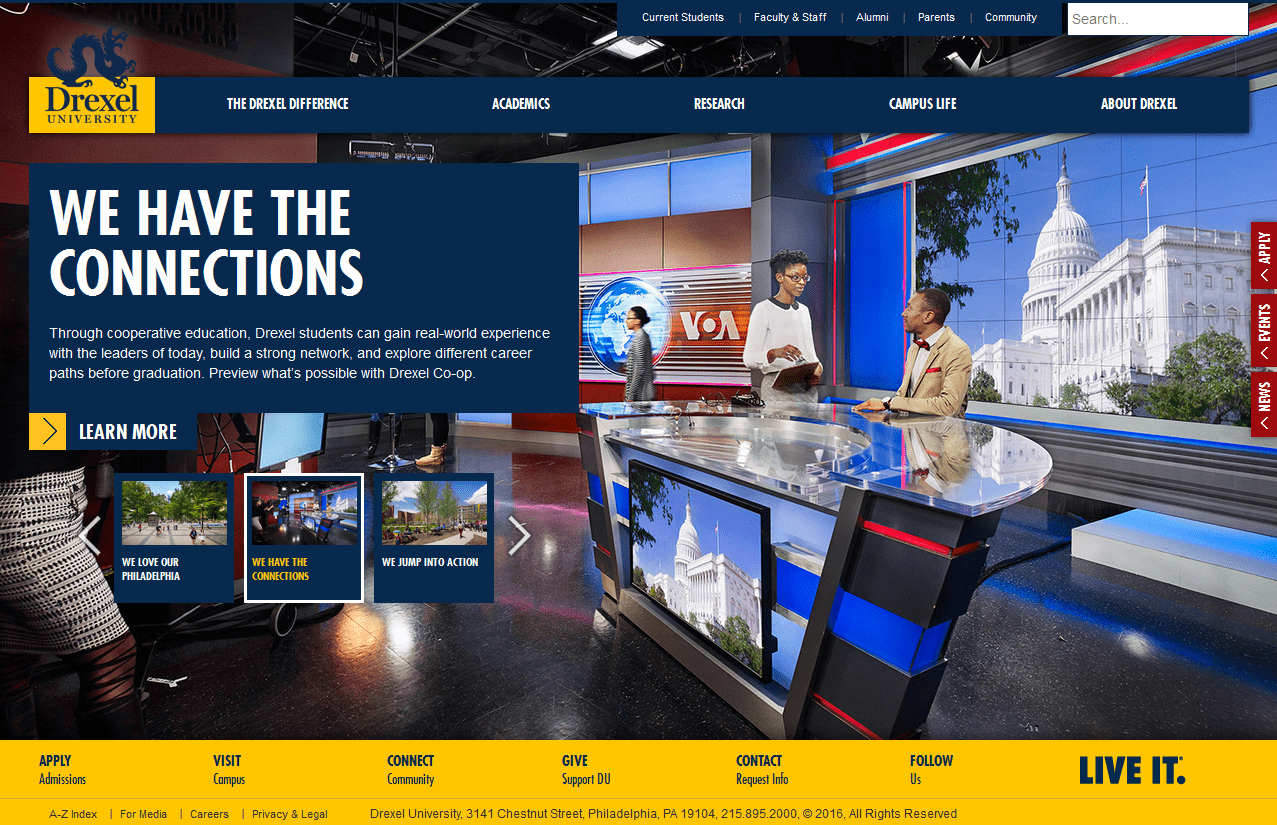
Now this website is a special one because it uses interesting storytelling through visuals and implements it nicely in the web layout. Swift though the image sifter on the left and you will notice how some images tell you the brand story. Another interesting part of their branding that blends nicely with the web layout is the unique identity mark. It is indeed rare to use a dragon as a logo symbol of an educational institution but this one is well-executed.
Clemson University
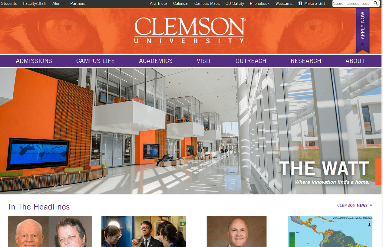
The site was created in-house by Clemson’s Web Leadership Team and Communications Council and was launched in 2013, the same it became responsive. The “Apply Now” CTA hangs vertically on the left side right under the search query. However, the brand color and the tiger mascot captures everyone’s attention. It was a challenge to design a web layout with such a stark contrast. The scroll bar is a bright purple along with a bright orange banner. The tiger eyes make it more outrageous and adds a distinct personality to the website.
Full Sail University
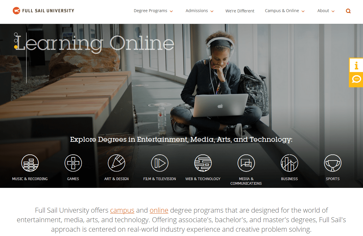
Full Sail University is an entertainment and media institution that offers courses such as video and film production. It follows the latest trends in website design and has moderately applied icons to make the home page less cluttered. The design and layout also makes an effective use of negative space and it’s a relief for the reader who is genuinely searching for relevant information. Check out the clean looking college website that has a record for being interactive.
Chaplain College
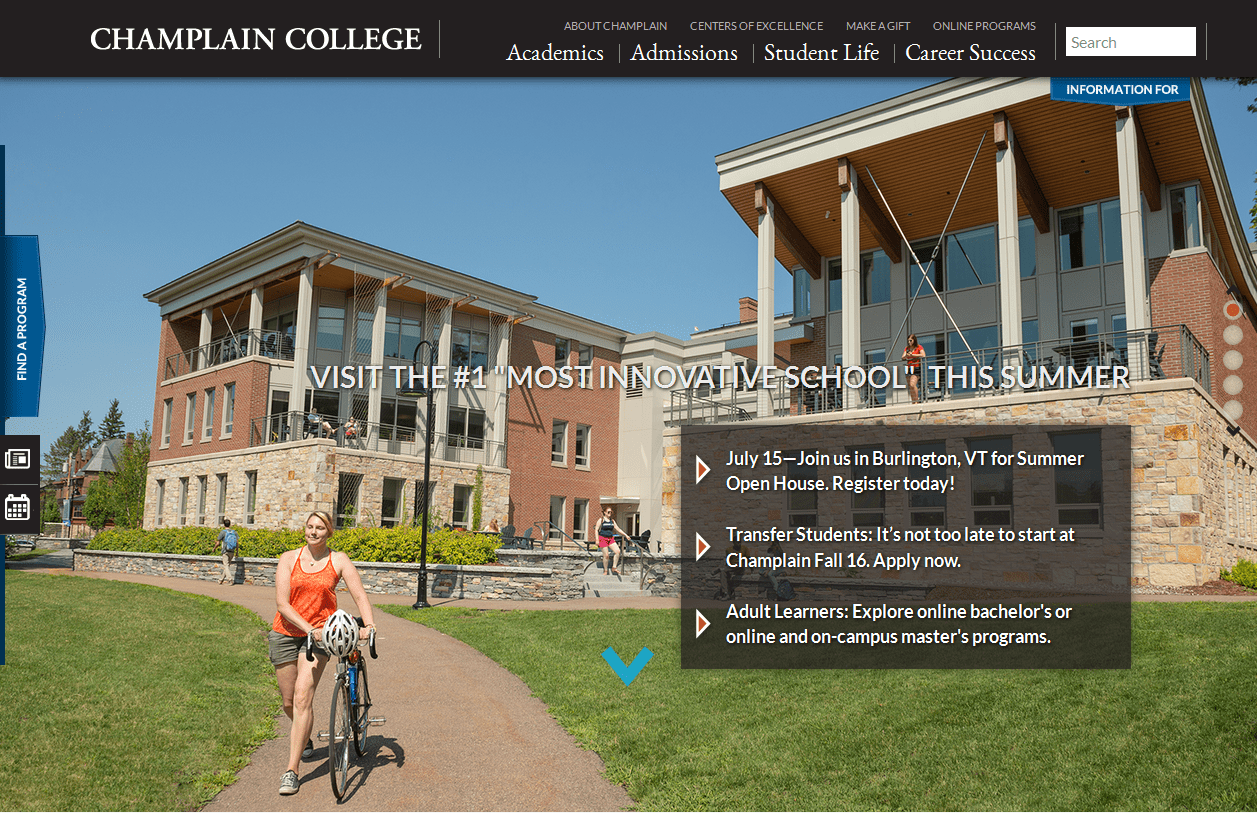
The web layout has a fluid motion scroll that takes the user through different sections of the website. It also provides internal pages for further details but limits the text on the home page. As for the interactive CTA’s, they are present on text that changes color upon hovering. Sophisticated images and excellent typography adds to an excellent user experience.