Color Me Wrong
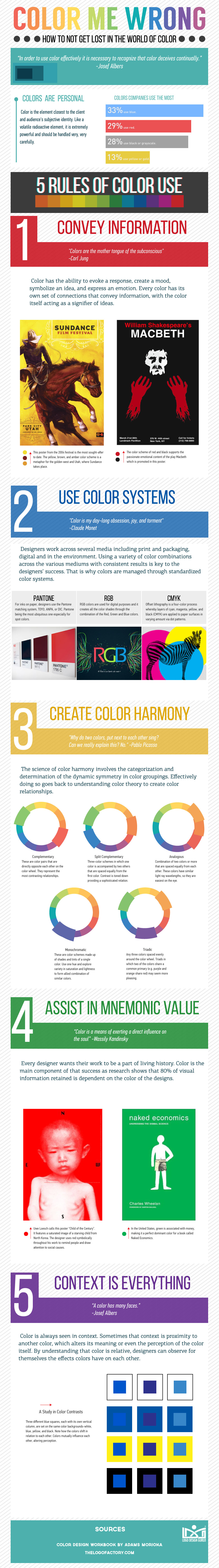
Lately, I have been reading a lot about the use of color, the emotions of color, what color brands should choose and so on. What has been missing from the conversation is the manner in which color should be used. If a company decides to use the color blue for its brand then should they use a complimentary color or one that contrasts? RGB or CMYK? What should be the context of color?
All these questions make a brand stumble if handled incorrectly so before implementing any color choice designers and marketers must be aware of the Rules of Color and that is what the infographic below conveys. The 5 Rule of Color Choices to make your color choice successful.
Share This:
Embed this Infographic on your site using the html below:
If you enjoyed our Infographic on five color rules, please consider sharing it using the buttons below!