Connection between successful Brands and HELVETICA
Update
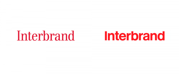
The lamest thing a brand can do when rebranding is to miss the opportunity to be creative, inventive and reflective. Right? The new Interbrand logotype is the victim of this ‘lame-game’.
They went from serif to sans serif font – and that too Helvetica. Yes, that’s it! I thought brands have moved on from the break-up but this typeface is like an ex-boyfriend stalker. Seriously. It’s half a century old, and although Max Miedinger started the era of minimalism with Helvetica, it’s now as mundane as Arial or Calibri. Guess I’ll mention this in #GetOverIt.

While the minimal approach urges brands to literally strip their logos, Interbrand was already stripped. They simply shifted from one font style to another, and I wonder if this is worth the effort. It’s not just a change of design, it’s a transformation that impacts brand image, people associated with it, and the marketing.
And you know what the irony is? They’re a brand consultancy company! They help other brands create corporate designs. This rebrand stunt makes me think whether or not they’re serious about their image.
Nevertheless, Helvetica did wonders for some popular brands including American Airlines, Harley Davidson, Target, Nestlé, and JC Penny. If you’ve noticed, these brands are from different industries and they all have unique visions yet Helvetica works for all of them. So what’s so attractive about this typeface that brands can’t resist it to this day?
Successful Brands And Helvetica
Designers have a craze for typefaces, where Helvetica top their list. A simple observation by any sane person can easily highlight that it is impossible to breathe without taking this typeface in. Whether, a contemporary or classic designer, Helvetica has been ubiquitous for everyone. Massimo Vignelli, the 20th Century designer also loved Helvetica to an extraordinary level. He quoted,
“You can say I hate you in Helvetica. You can say it with Helvetica Extra Dark, if you want to be really loud. You can say I love you in Helvetica. You can say it with Helvetica Extra Light, if you want to be really fancy”
Helvetica is more than half a century old among other typefaces but still it dominates the world of fonts. You would observe it on every other Hollywood movie poster, in books, in designs and corporate identities. Over 40 companies are using Helvetica because of its clarity and uniformed lettering. For instance, Target, BMW, American Apparel, Bell Atlantic and more. This infographics is an effort to present a compact view of Helvetica used by popular brands for successful branding.


