Deconstructing Logo Designs of International Brands
Feature Image Source: freepik.com
It’s tricky to get a truly ubiquitous logo design. These logos have to make continuous appearance to create an impact in the minds of their audience. However, the most memorable ones end up being simple and memorable for consumers around the world. A huge populace will never know what a logo stands for, much less what goes into its making. This is due to the excessive clutter of ideas floating around us. That’s where we come in. The idea of deconstructing logos is to enable users to understand the true meaning behind the conception and construction of logos.
Human brains are conditioned to subconsciously identify a brand through a process of ingrained rote learning. In fact, in a fast paced time and space, nobody stops to think about the “whys” and the “hows” of brand designs and core principles. We just move on ignoring a lot of signs around us. Truth be told, the consumers will notice the subliminal messages without consciously knowing the meaning. Most of our subconscious understanding affects our conscious decisions. How many times have we bought a product, bring it home and only to realize that we don’t really need it? What triggers those erratic decisions? Is it the branding, or the hidden message in a logo?
Why deconstruct logos?
The design community looking for inspiration will always be enlightened by the deconstruction of a logo design. For them, logo design deconstruction will serve as a practical guide with ideas that could be implemented in their own designs.
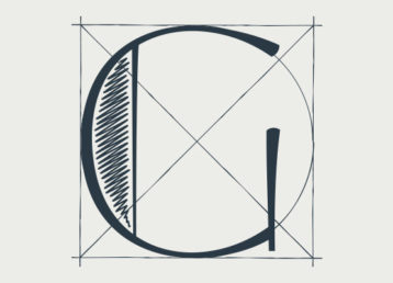
Deconstructing logos will enable you to visualize how a logo was created in the first place and how it conveys the core brand message. We will break it down to the choice of fonts and the development of wordmark to reveal the concept behind the inception of that logo design. Also note how the icons and colors of a logo push the company’s message forward among other brands. This video will show logo designs of popular brands that we come across everyday but never realize their real meaning.
The setting: Times Square in Manhattan, New York (Courtesy of 8K Next video maker).
The focus: Famous logo designs at the junction of international brands.
The idea: Deconstructing logo designs to reveal their core elements and unlock the brand message in the iconic symbols.