10 Democratic Logo Designs That Depict Personal Branding Excellence
In every four years, the presidential campaigns splits the US into the left wing and right wing supporters. This interesting quest for the white house keeps the respective supporters engaged who want to see their candidate win the election. However, very few electoral candidates rise above the image of their representative party. Studying the US Democratic and Republican logo designs, we can witness a new design trend emerging in political logos. Precisely they have 2 ways to get noticed, either with a notable marketing strategy or with iconic visual imagery to make them stand out in a group of contenders. Some skillfully employ the emerging phenomenon of personal branding to kickstart their presidential campaign and their logo design incorporates their personality traits accordingly.
What Is Personal Branding?
Personal branding is the practice of people marketing themselves and their careers as brands. While previous self-help management techniques were about self-improvement, the personal–branding concept suggests instead that success comes from self-packaging.
“Looking at election campaigns in other countries, it always strikes me as odd how little the campaign logos reflect the personality of each candidate.”
– Matthias Mencke
Usually, the visual identity of the campaigners have to reflect the party they are representing, which perhaps offers less freedom for the designers of political logos. Yet they have succeeded in creating a visual identity that represents the candidate as a brand. Take a look!
Bernie Sanders
Image Source: logos-world.net
It’s not just the visual imagery but the overall captivating persona that made Sanders nail personal branding. He immediately became a sensation and almost narrowed the gap on the former Secretary of State Hilary Clinton after he announced his campaign earlier this year.
His campaign logo and slogans also caught attention from critics and fellow campaigners. The logo takes a minimal approach and the choice of colors is not totally divergent from the flag colors but certainly has a subtle tone to it. The font choice is elegant and solid and gives the logo a breezy feel. No wonder the youth “felt the bern”.
Hilary Clinton 2016
Image Source: underconsideration.com
Now what’s different about Hilary is the fact that she stood up for women rights and her logo slightly appears to elevate feminism along with promoting her identity. When it was initially launched, it got a brutal response and critics openly bashed it with sarcasm and mean comments. However it was the very first time that a democrat logo stepped aside from the usual ‘only-patriotic’ imagery. It is a clear example of personal branding and Hilary officially becomes the first to reflect her image through a single-letter logo. It was a volunteer contribution to the campaign by the famous designer Michael Bierut. Besides being a symbol of her personality, it is conveniently friendly for all social media platforms where she plans to execute a good part of her campaign.
Barak Obama (2008 & 2012)
Image Source: 1000logos.net
It seems like the democrat candidates are setting a trend by using letters in their logos symbolically. Obviously Hilary was not the first to use her initial symbolically, Obama’s logo started it off with letter ‘O’. It was one of the most remarkable logos when it first made an appearance in 2008. It’s both visually impressive and works fine as a standalone icon. There were only a few changes in the visual representation but the basic logo remained the same. Designers kept the traditional red, white and blue but created a symbol of hope showing a dawn and a pathway that truly became Obama’s presidential campaign identity. That’s a kind of personal branding you will rarely notice in political campaigns and movements.
John Kerry 2004
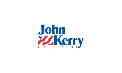
Image Source: wikipedia.org
The effect of his presidential campaign logo is striking, simple and beautiful. The type selection is not too fancy, and the flag adds a positive energy. However, it’s notable that it hasn’t stepped away from the usual patriotic look that almost every other Democratic Party candidate logo has. Its visual brevity and lack of extra detailing makes it ideal for personal branding.
Darcy Richardson 2012
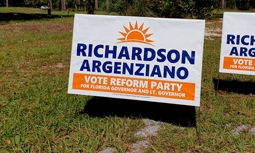
Image Source: facebook.com
Darcy is an American historian, author and political activist. He used a simple type-based logo incorporating the patriotic colors but limiting the multiple aspects of his personality to one symbol. The use of the striking orange color to create a more approachable appearance says that he’s more than just a politician. Overall, the logo presents Richardson in a positive light and deviates from commonly used color schemes.
Gore Lieberman 2000
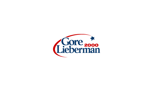
Image Source: wikipedia.org
At first sight, it looks like the logo of a space station but it practically went on to establish a strong visual message. It’s simple but refined, applies the usual elements and symbols but fits into the criterion of consistency displayed by the democratic candidate logos. The choice of font creates a visual balance which means it’s not too thin to create visibility problems nor is it too thick to radiate sternness.
Bill Clinton 1996
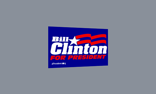
Image Source: wikipedia.org
The logo brings Clinton into the limelight both literally and figuratively. Note how his first name fits above 2 letters leaving ample room for a waving flag whose star icon is part of the letter ‘I’.
Bill Clinton easily defeated the leading Democratic contenders in the 1992 primaries, despite charges about having avoided the Vietnam draft and his rumored affairs with women. His logo depicts his political acumen and strong leadership abilities.
Joe Biden 2008
Image Source: wikipedia.org
Now this particular logo beats all others in terms of simplicity but lacks the potential of design. He is currently the 47th and the Vice President of the United States who lost to Obama in the presidential campaign for 2008. The font selection for the logo was marvelous and eliminates the need to add extra details. The surname displayed in blue radiates a professional eloquence. In contrast, his recent logo looks amateurish with an extra thick font.
John Edwards 2008
Image Source: wikipedia.org
John is a former U.S. Senator from North Carolina. He became famous after that message in his “Two Americas” speech and is also known for his overall optimistic, and positive attitude. The palette indicates flag colors without relying on the expected stars and stripes imagery. There is though one emerging star rising from the bottom of the logo, truly representing the candidate’s persona.
Christopher Dodd 2008
Image Source: wikimedia.org
As a result of unpromising results in the Iowa Caucus on January 3, 2008, Dodd dropped out of the race for the presidency, and endorsed Barack Obama but he was a promising candidate that year. The logo in the naval blue background makes an immediate impression. It flies in the face of everything we’ve come to expect of a campaign logo.
Despite some slow milestones, political logos have indeed made some progress in terms of design excellence but it’s further interesting to note that candidates have started to incorporate personal branding attributes to the presidential campaign.


