#DesignerSpotlight Susan Kare – How to Become an Expert Iconographer

How many icons do you see in a day? Perhaps, it’s hard to keep a count because…
We come across millions of these mini visual delights that make our understanding of the digital world stress-free. Without icons, it would be a dread to only see text all the time. The beauty of an icon is that it incorporates extensive ideas into a compact visual.
In fact, icons are a help for graphic designers who are not sharp in their language skills. As long as they know the function of the icon, they can easily use any design software. For example, an Japanese designer can use an English software by recognizing icons.
Realizing the growing use of icons in web design, app design, and graphic user interface, it is a good idea to learn from icon design experts.
About Susan Kare
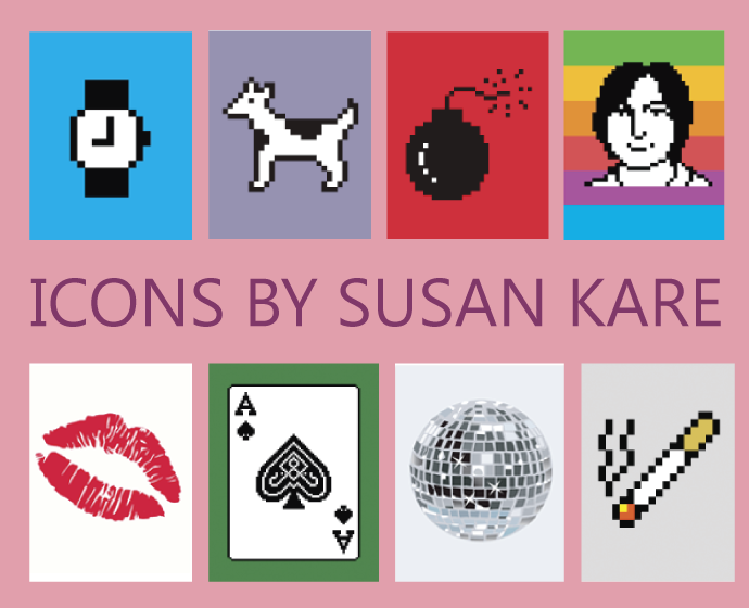
She’s the one who designed some of the most iconic icon designs and interface elements for Apple Macintosh, Microsoft, Facebook, IBM, NeXT etc. A graphic designer and artist, Susan Kare made memorable icons still used today.
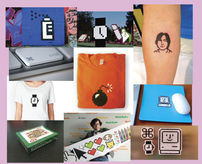
Her icon designs have stretched far from the digital sphere into the real world via graffiti on walls and tattoos on body parts. Seeing the popularity of Kare’s icons in the popular culture landscape, the Museum of Modern Art souvenir shop in New York City began featuring Kare’s designs on notebooks and stationery.
See her portfolio
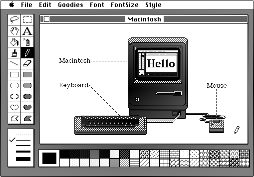
The Macintosh Experience
Susan Kare in an interview with CNNMoney said, “It was cool to see those features come to life.” The part where you make shapes, add texture, scale objects and just play around with in-built tools to create meaningful icons.
When graphic designers think about Adobe Illustrator 7 in comparison with the latest versions, they literally laugh over the constraints back then and thank developers for the freedom of choice they have now. However, at the time, Kare felt wonderful even with those limitations in a Mac.
Interaction Via Icons
The way we interact today mostly involves the use of an array of symbols that guide users to navigate on social media platforms, websites, electronic devices, software etc.
Connect with the designer @SusanKare
Become An Expert Icon Designer
As the world is increasingly depending on digital devices, designers are investing their skills on icon designing to simplify and uplift the various digital interfaces. Do you want to become an icon designer? Here are some awesome tips you can use to become an expert in iconography.
Short History Of Digital Icons
Knowing the history of digital icons helps us determine the progress of iconography. Until and unless we understand the worth and the journey of a field within graphic design, we cannot really acknowledge its value. Iconography existed in 3,000 BCE when Egyptians used Hieroglyphics to communicate messages.
Susan Kare started designing black and white icons using a grid on the Apple Macintosh computer during the 1980s. During the time, the style of icons resembled pixels, and designers created icons on a canvas as small as 32 by 32 dots.
After the introduction of advanced technologies and tools, implementing the design of icons became less challenging. For example, Andy Hertzfeld developed the icon editor, which allowed iconographers like Kare to turn pixels off or on. It also generated hex representations (codes) to assist software developers to embed icons in the user-interface.
Later to add a sense of activity in icons, Kare tilted the icons at an angle to visually show verbs in action like writing, drawing, walking etc. Unlike now when we can actually, animate an icon.
The 1990s added a splash of color in design. When Kare worked for Windows, she used a palette of available colors to add yet another dimension to her icon designs. From the 16 colors, she used around five to create the well-known solitaire game card deck baby boomers and millennial enjoy playing till now.
Then millennium led us to social media websites being the abode of friends, families and strangers to discover each other and interact using icons. In 2007, Kare designed colorful gift icons for a game on Facebook on 64 by 64 pixels screen. The new thing here was that companies sold these digital icons for real (not digital) money. Fascinating.
Later the canvas to design icons became 96 by 96 pixels that gave enough room to experiment more creativity. Today you have the liberty of designing on 1024 by 1024 pixels. You can add movement, using effects, more hues, and different styles but most commonly flat designs or skeuomorphic.
The Stages Of Icon Design
Explore
For a graphic designer, research is important. However, you mustn’t only truly look at things when you have a project at hand. Instead, you should constantly observe things, people, and places. In addition, you should get as much information as you can about your surroundings. This knowledge will surely help you when the time comes.
If you have a project, you should carefully study the client’s brief and start your exploration according to it. It is important to stay updated on latest graphic design trends; so that people living in the contemporary realm understand the icon design, you have created.
Brainstorm
To become an icon designer, it is necessary that you know how to translate things on paper. Knowing the skill of drawing will be handy. In Designing Web Sites that Work: Usability for the Web, Tom Brinck, Darren Gergle and Scott D. Wood suggests that an effective way to collect ideas for representing a concept in an icon is by asking a number of different people “to draw, sketch, or simply describe the images they would use to support such concepts.”
You prepare mockups and test them out by gathering information regarding their versatility, appearance and meaning. This stage is critical to the success of your digital project, such as a website, a mobile application or a user-interface for a device.
Implement
It is time to execute your concept on a digital canvas. You transfer your rough sketches onto a screen using a software. These include
- Adobe Illustrator – a drawing and editing tool to create vector graphics such as icons and logos. You can use the fabulous tools it offers to assist designers in making a professional artwork and designs for your branding and marketing. To construct an icon, you can use different tools for color, texture, brushes, gradients and a lot more. Two essential tools for icon design is pen tool and pathfinder tool.
- Adobe Photoshop – it is a brilliant image creation and editing software. If the RAM of your computer or laptop is efficient, and you have installed a graphic card then you can easily create 3D illustrations. To make realistic icons, you can use tools for filters, colors, textures, alpha masks etc.
- Corel Draw – this is a basic tool, newbies in graphic design can learn much quicker than other complex design software. To make icons, you can use a variety of tools like shape edit, crop tools, smart tools, interactive tools, eyedropper, fill tools etc.
Personally, I love Adobe Illustrator. It is easier to make drawing based creations. There is flexibility in changing the form of shapes. Using the perspective tool, a graphic designer can design icons of buildings and other three-dimensional objects.
Assessment
At this stage of icon designing, you need to test the effectiveness of your icon designs by using several techniques. Aurora Bedford, a user-experience (UX) specialist, shares the following ways you can evaluate the overall design and function of an icon.
- Icon Location Test – involves the measurement of time within which test users locate and click a particular icon when placed on the full user-interface design. Incorrect selections indicate that your icons aren’t easy to differentiate, hence you need to review them.
- Icon Recognition Test – in this method, you display icons in front of users. They need to guess what each icon symbolizes. This insight suggests whether the icons you created are recognizable or not, and can people deduce objects to their simplest forms with the help of the icons you presented.
- Icon Functionality Test – If the user is able to recognize the mundane living or non-living object, you have portrayed in the icon then well and good. However, what’s important here is that users must know the functionality of the icon – i.e. what does it do. Instead of asking users what an icon represents, you should ask them what they expect will happen when they click on the icon. This is known as the information-scent method, which can be done through A/B testing.
- Icon Attractiveness Test – not all icons are appealing. Thus, you ask the participants to score the icons on a scale of 1 to 7. If you have two design versions of the same icon, then you can ask people to pick the best one. Another way to judge the appearance of your icon design is to show an icon family and ask people to make comparisons.
While you conduct experiments, steer your focus towards three facets of an icon:
- Appearance
- Accessibility
- Recognition
In icon designing, a graphic designer needs to concentrate on both the user-interface and the user-experience.
Common Design Elements In Icons
As a graphic designer or more specifically an icon designer, you need to comprehend the meaning and usage of graphic design elements and principles.
Perspective
In order to give an illusion of depth, designers use two-point and three-point perspective to create icons. Leonardo da Vinci, the great artist, explained us about the three aspects of perspective. “The first has to do with how the size of objects seems to diminish according to distance: the second, the manner in which colors change the farther away they are from the eye; the third defines how objects ought to be finished less carefully the farther away they are.”
Two architects, Filippo Brunelleschi and Leon Baptista Alberti in the 15th century, developed this concept. When creating icons, you need to be careful about linear perspective (composition of shapes in space) and aerial perspective (deals with atmospheric colors and tones).
When illustrating an icon, graphic designers should keep this element of design in mind. It is a good trick to make people believe that an object or landscape within the icon is real.
Shadow
These days, you must have observed that long and definite shadows are trending in the graphic design industry and in iconography. To achieve this effect in an icon, you can use the blend tool. You can learn to create this here.
Where there is light, there is shadow. If you’re not using perspective in your icon design then a shadow will help you to uplift the symbol, illustration or text. In Designing With Light and Shadow: 10 Highly Effective Tips You Should Try on Canva, the author says, “Adding elements of light and shadow into your designs can help bridge that gap, giving your 2D designs a more realistic, almost 3D appearance.”
However, graphic designers can use this technique to an extent. Don’t overdo this effect on a canvas that’s comparatively smaller than other graphic design items. If you add dimension, perspective, depth, realism into your icon design for apps, you can create a visual interest for app users. Thus, they will click on it and check it out.
The key terms you should know when using this trick are:
- Highlight – the area of an object where the light shines the brightest
- Core shadow – the darkest area of the object where there’s no light
- Cast shadow – the shadow of the object on the plane it is sitting on
- Light source – the source where the light is coming from
In icon designing, you as a graphic designer need to create an imaginary light source to make shadows and highlights.
Lines
Some icons only have lines. There is no color fill. These icons are simple or as we call it ‘minimal’. How can you attract viewers with this method only? In Drawing by Human Artists, Forrester Cole suggests four ways a line drawing; in this case, a line icon can infuse interest in the design.
- Emotional and explanatory – with lines alone you can describe a scene or evoke positive and negative emotions
- Loose and controlled – you can control the line style to make rough icon sketches or full-fledged detailed drawings
- Sparse and developed – your imagination can take the user wherever you want. In icon design, sparse lines make icons user-friendly and understandable.
- Veridical and abstract – using lines you can make an icon as real or abstract as you want.
If you vary the thinness and thickness of lines, you can create a sense of movement or realism in your icon design.
Shapes
The psychology of shapes in graphic design is an extensive study. The shape of a heart (organ) is different from its graphic depiction. What is it? A combination of two circles and a triangle. Yet over the years, this shape has become a symbol of love.
In How To Create Effective Icons, Andrew Beck (designer) shares that you can create icons using basic shapes: square, circle, triangle and rectangle. How? If you work in Adobe Illustrator then you use the Pathfinder tool to join more than two shapes to make shapes that are more complex.
When designing an icon, you only need to make sure that you ‘think simple’. How can you portray any object, place or human in its simplest form? Keep practicing. Pick a real object a day and use the above-mentioned four shapes to make it. You can curve the corners or make a circle into a semi-circle. Keep doing it. To check the effectiveness of your icons, use the icon assessment techniques.
Color
Constantly professional graphic designers, graphic design teachers, and writers tell us that color has a significant role in the design industry. You can use colors to create harmony and/or to create conflict. It depends. As an iconographer, you need to see what the product is. To make an icon for a fighting game app, you may need to use complimentary colors. On the other hand, to make a Lolita fashion website you would use analogous colors.
How will the twitter icon look if it was in any other color than blue? Graphic designers conduct a thorough research before selecting colors for an icon. For example, what happens after you decide that yellow will be best for the Snapchat icon? You figure out which shade of yellow will work. What more colors you can use with this yellow? All these questions are a sign of creative thinking.
Use programs like Adobe Kuler or Coolors to generate color schemes. You will get the RGB, CMYK, and Hex codes, which you can easily translate into the software you’re using.
Free Icon Resources
The availability of icon templates these days allows designers to use free icons to add to a design. You can download the Encapsulated PostScript (EPS file) or Adobe Illustrator (Ai file) to be able to edit the design.
This is a good option for digital marketers with a sense a design. If they wish to use icons to promote a website, landing page or a blog post. FYI, I’ve tested these websites and the icons are of good quality.
- Flaticon – home to thousands of free colorful icons and icon families with several categories to cater to a number of businesses.
- Freepik – an abode for free files in the following formats: PSD, Ai, EPS, SVG, and PNG. You can pick an icon and download in the color and size options given.
- Icon Finder – there are free and paid icon bundles with flat designs, and skeuomorphic icons with a 3D appearance.
Here are useful tips from Susan Kare to design amazing icons.