Typomania: Embrace or Reject Futura!
Many types of fonts are effectively utilized in graphics, according to the characteristics which complement the overall brand image. However, the distinction between popular fonts and the appropriate font choice is often misunderstood. You would observe that the use of Helvetica and Futura is pretty common in customary brands, as compared to other type faces.
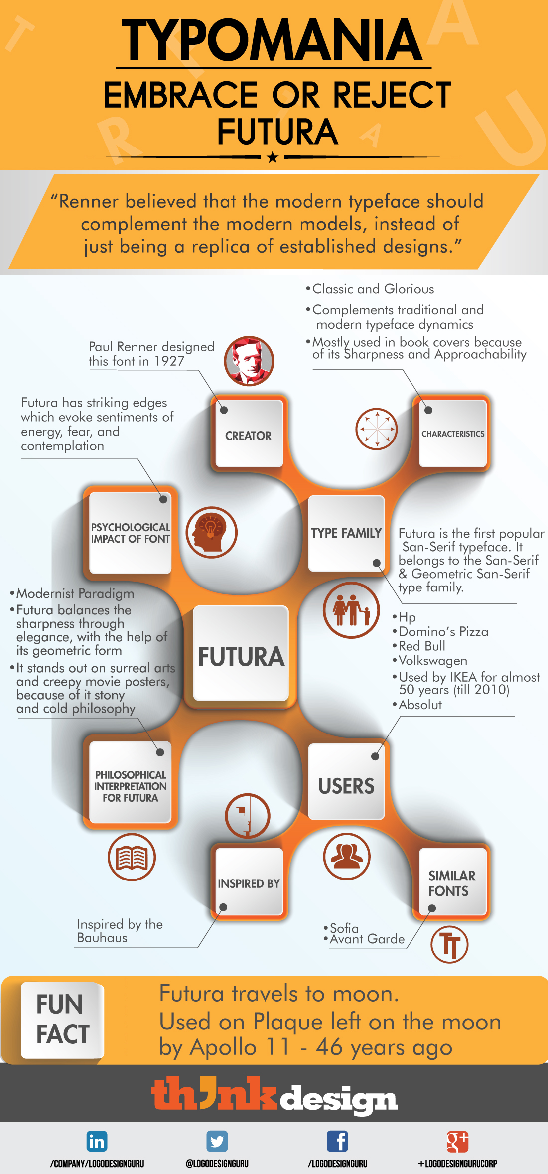
What is the reason behind the popularity of Futura? Is it because brands, such as Absolut Vodka, HP, Domino’s Pizza, Volkswagen, and Red Bull have used it? No! There is a science behind choosing the font that we tend to forego. Therefore, we thought of starting #typomania for making font choice easier for our graphic designers. This month, I’m talking about the Futura TypeFace, which is popular and my personal favorite.
Design and Creation:
Paul Renner designed Futura in 1927, which is inspired by the Bauhaus. Futura is the first popular San-Serif typeface, and belongs to the San-Serif & Geometric San-Serif type family. Avant Garde and Sofia have almost similar visual appearances as that of Futura.
Characteristics:
Futura is known for its classic look and glorious presence on graphics. It not only complements traditional dynamics but modern typeface subtleties as well. It is mostly used in book covers because of its sharpness and approachability.
Psychological Impact:
Futura has striking edges which evoke sentiments of energy, fear, and contemplation. Therefore, you would observe that it is often used in logos for energy drinks. Moreover, you can also use it is in the design of intense movies posters and book covers.
Philosophical Interpretation for Futura
Futura is different from other fonts because of its uniqueness and versatility. Though it is designed on the modern philosophical paradigm, it also balances the sharpness of characters through elegance with the help of its geometric form. Furthermore, it stands out on surreal art and creepy movie posters because of its cold and stony philosophy.
The following infographic will help you understand the correct use of the Futura font. Additionally, it will make it easier for you to choose the right font for your design:
Share This:
Embed this Infographic on your site using the html below: