Hidden Messages in 27 Famous Logos

Image Source: SIphotography/iStock.com
Ever come across a logo that you have seen a million times, but one day you notice a small detail that blows you away? If you haven’t, the following 26 famous logos will be quite interesting. Using different tactics you can add more meanings in a logo. These logos are well known, so you may have seen them, but today we’ll focus on the hidden messages within each of them.
1. Icons8
The company’s name is Icons8. So, it’s logical that its logo contains the letter «I» and figure «8». But it’s not as simple as you might think. «8» also means infinity, as Icons8 offers a literally endless number of graphic assets.
2. FedEx
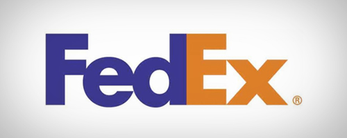
This logo has been around for over a decade and I am very familiar with it as well as the company’s services. However, I never saw the hidden arrow within the logo. Take a close look between the E and X. See it? This arrow (in the negative space) represents precision, speed and accuracy.
3. Toblerone
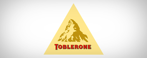
Do you know where Toblerone chocolate is created? The company is located in Bern, Switzerland which is also known as the City of Bears. The mountain in the Toblerone logo embodies the City of Bears by incorporating a bear in it. Have you found the bear?
4. NBC
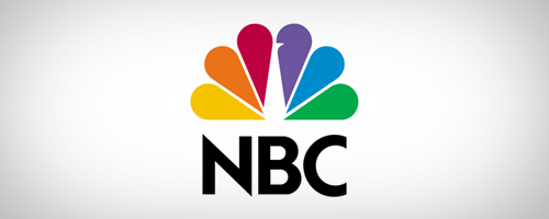
Ever notice the peacock image in the NBC logo? The most recent logo makes it hard to spot, in older versions the peacock was more visible. The peacock faces towards the right, symbolizing the company’s motto to look forward.
5. Baskin Robbins
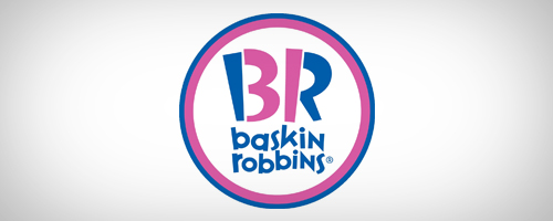
Their slogan, 31 Flavors of Fun, made them a commercial success, as did their logo. The number 31 is significant because Baskin Robins carries 31 flavors of ice cream. If you look close, you can see the number 31 placed between the letters.
6. Goodwill
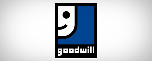
This one is easier to spot. The letter G in the logo is also a smiley face. It was the company’s way of showing a gesture of…should we say, goodwill?
7. Nike
Did you know Nike’s logo has a hidden message? Not many do! The famous swoosh used by the company represents one of the wings of ‘Nike,’ the Greek goddess of victory. Interesting, huh?
8. Hope for African Children Initiative
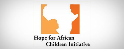
This logo looks like a map of Africa but after a closer look you will see two people (a child and an older person) facing each other.
9. Big Ten Conference
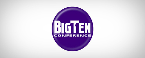
Currently there are 12 schools in the Big 10, but at one time there were 11. So, in the logo the company decided to include the number “11” in a subtle way. Since the growth of the Big Ten Conference, the company was not keen on change their cherished logo so the number 11 remains.
10. Pakuy
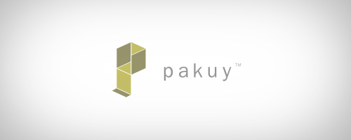
Pakuy is a packaging company with a logo that is simple and clever. The logo looks like the letter P, standing for the company name, while it also looks like an unfolding box. It’s a great way to represent the company and its services.
11. Hershey’s Kisses
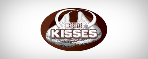
I love this one because the symbolism is hard to find and many people often too busy devouring the chocolate, instead of noticing it. Before you dive into the bag, take a look between the letters K and I. You’ll be surprised to find a hidden Hershy’s kiss there!
12. Yoga Australia
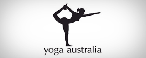
In this logo, you will notice that the image is of a woman in a yoga pose which also makes the shape of Australia. It’s hidden between her arm and leg.
13. Apple
Who isn’t familiar with this logo! It is the image of an apple that has been bitten. Simple and straight forward. But the symbolism people relate to this logo is perhaps not as simple. There are quite a few theories regarding the symbolism of the logo.
The current Apple logo is a modern and evolved version. The very first Apple logo had the image of Sir Issac Newton sitting under an apple tree while the second logo (rainbow Apple) was derived from Newton’s prism work. Some people like to believe that the logo indirectly symbolizes the forbidden fruit of Adam and Eve, depicting lust and knowledge. Well not literally perhaps, but Apple products are (sinfully) addictive hence the symbolism feels right, to me at least 😉 A few people even believe that the bite in the logo refers to the computing term 8 bytes or binary knowledge. Although designer, Rob Janoff disagrees with these theories.
So, what do you think? Which of these theories would you root for?
14. Sony Vaio
At first, I had no idea about the hidden meaning in this logo. The curvy V and A actually indicate an analog wave or a signal. The I and O represent the binary digits 1 and 0. Very unique, creative fitting for this type of company!
15. Milwaukee Brewers
Are you a baseball fan? If so, then you may recognize this logo. The Milwaukee Brewers logo is shaped like a baseball glove holding a baseball. But look closely, do you see the B and M?
16. Atlanta Falcons
Let’s talk sports again. The logo of the Atlanta Falcons is easily recognizable. The beak and claw of the falcon are reaching out; can you see what it creates? The letter F.
17. Amazon.com
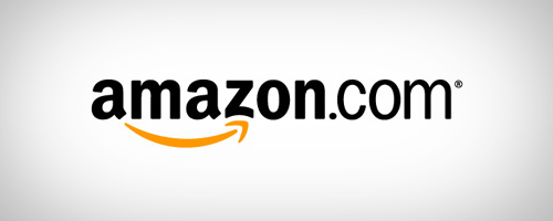
Most people have used Amazon.com. The logo is very self-explanatory. The text spells out the company name, but the arrow under the A and Z is quite interesting. Its Amazon’s way of saying they carry everything from “A to Z.”
18. Sun Microsystems
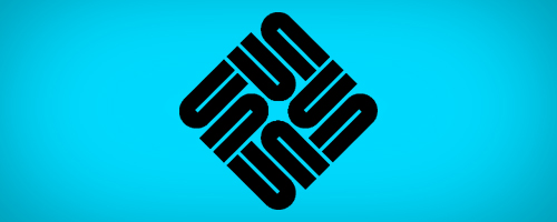
Before they got taken over by Oracle, this was their logo. The design is a very unique way of displaying the letters that spell out their name, S-U-N. No matter which way you are looking at the logo, you can read the word SUN. This was stunning work done by Vaughan Pratt.
19. Northwest Airlines
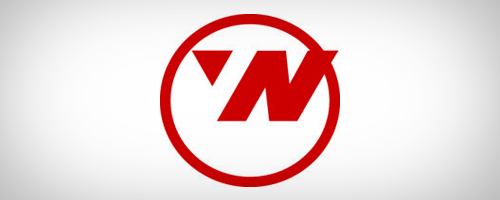
This is the older Northwest Airlines logo, but it deserves a mention. The letter N is visible can you see the W? And that’s not all. Look even closer, can you see the compass? Which direction is it pointing in?
20. LG
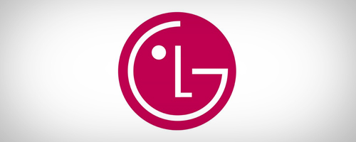
A masterpiece of creativity, this logo depicts the letters L and G easily. The L and G seem to make a face, almost with a winking eye. But, if you take the design a bit further by tilting little to the right and align the L with the edges you’ll see a PacMan!
21. Washington State University
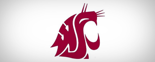
This is one of my favorite logos and my favorite school. WSU really did a great job with their logo, representing the university mascot and the 3 letters that define the university. Can you find the letters?
22. ED
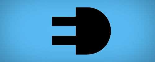
The Italian electric company used went about their logo in a very unique way. An electric socket is used to represent the company and its services. The socket represents providing electricity, as well as forming the letters E and D.
23. Tour de France
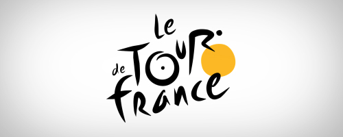
Tour de France is all about bicycling. Can you spot the cyclist in the logo?
24. Pittsburg Zoo
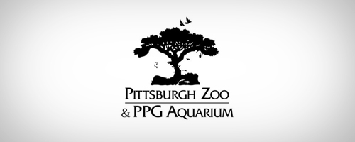
Zoo logos tend to have a common theme, featured animals. The Pittsburg Zoo’s isn’t much different. If you look carefully at the white space under the tree, you can see a lion and gorilla. This is one of my favorite logos; its creativity never ceases to amaze me!
25. Mammoth
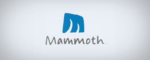
I’m a huge fan of the movie Ice-Age so when I saw this logo from the California based ski resort, it instantly made a connection. They created the letter M with a piece of animal imagery (Mammoth tusks-do you see them?), it’s really creative!
26. London Orchestra
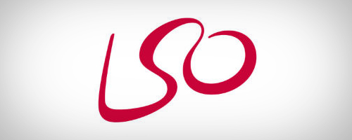
There’s another beautifully concealed image here! The most amazing orchestra conductors have performed with the London Orchestra. Can you see the conductor in the logo? The L and O make up the arms of the conductor while the links between the two letters create the head.
27. Unilever
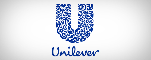
I saved the most intricate for the last! The Unilever logo is composed of 26 different icons, each representing one of their products and services. An example of one would be a palm tree which represents nature and products that have coconuts, dates, palm oil etc. (Unilever logo explained)
Some logos are truly amazing and creative because of the innovation involved in their creation. You should get a creative logo that provides your company with a great branding option and tickle our imagination when we make the connection between the company and its brand.
Blog Update: 15 May 2015
*This post was originally written by Sana Khan.
