#HitorMiss–The Major & Minor Logo Redesigns You Didn’t Notice

Rebranding is a risky business and it takes a lot of research before launch. One wonders what the first question to ask on the matter can be? How to rebrand? Of course not. It’s why rebrand? In this article we will discuss some commendable and minor logo redesigns of the year that went unnoticed which is kind of strange given the fact that nothing goes undetected in an age of social media. Check out these surprising examples of rebranding of the year.
Major logo redesigns
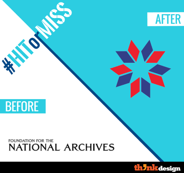
1. National Archives gets a star
National archives holds and secures a treasure of US heritage and generates funds and creative support for exhibitions and educational initiatives. This phenomenal organization never represented itself with any iconic identification. From now on you will see the National Archives Foundation star icon in negative space. It takes the conventional red and blue but certainly looks professional. It was designed by the students of School of Visual Arts, New York as part of a course in which students do real world work.
2. Heinz Kraft – the mayo ketch duo
The merger of Kraft foods with Heinz has been predicted for a quite a while clouded with rumors for the new business relationship but their logo merger is surprisingly compatible. The typefaces were adjusted to smush the two logos together. While this is a major change and it will continue to be the corporate face, you will notice that the packaging of the two brands will remain undeterred. Share your criticism about this major design change. Do you think it’s cohesive or fragmented?
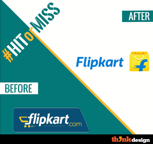
3. Flipkart the transformation from cart to bag
It’s not a Facebook minion, it’s Flipkart’s rebranded image. The iconic cart with wheels was nicely incorporated with letter ‘f’ but the dot com at the end was a huge turn-off. Well, thankfully they got rid of that but introduced a bag that appears to have a smiley face. It’s a stand-alone icon that goes perfectly with the image of the brand. Since the cart is removed, they felt the need to add some speed lines which is ingenious.
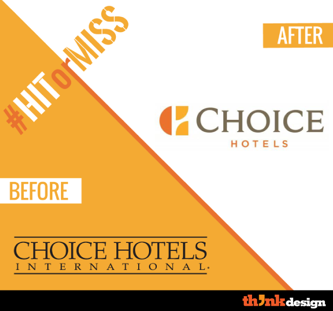
4. Choice hotels add some color
Choice hotels have dumped international from their logo and welcomed a symbol that is hard to decipher. The selection of color and font makes it an improvement and that is why we have classified it as a major logo redesign. Though the font choice is smart but there are quite of few mixed opinions about the logotype. How far off is the new logo from the original one? Share why you think it’s a #hitormiss.
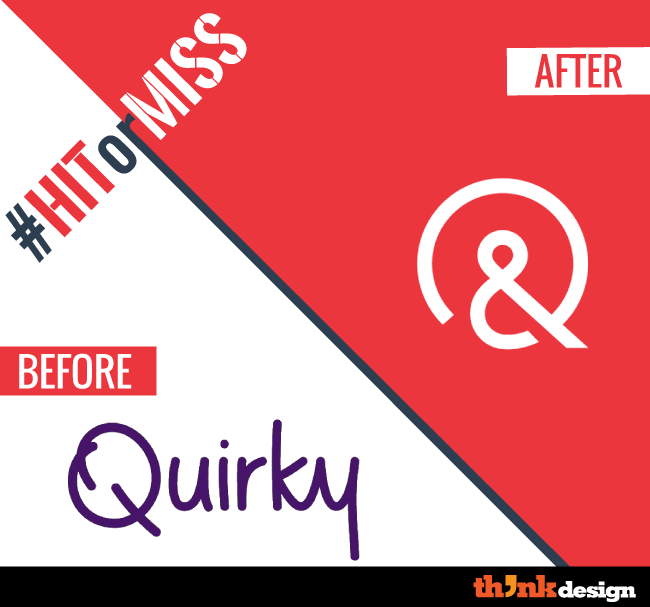
5. Quirky takes some unusual turns
The logo transformation is from simple letters to a symbolic wordmark. The choice of color is impeccable and shift to minimalism is impressive. Notice the clean edges and the way this letter ‘Q’ makes its appearance for the first time when the website loads. Quirky is all about collaboration and making connections so the ampersand is a nice metaphor for it.
Minor logo redesigns
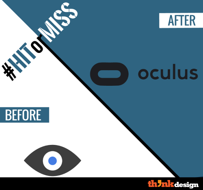
6. Oculus – A tech innovator gets unconventional
The new logo looks like a view finder but what was the real need to change the logo. Do you feel it was a smart move right before the gaming season? The new logo hit the market in the peak gaming season this year. This new logo was a leap forward because it is utterly imaginative and displays the product in an extended ‘O’. The font makes a perfect fit in think lowercase. Only time would tell how this new identity will shape the future of this tech innovator.
7. Run keeper run!
Runkeeper is one of the leading mobile apps for runners and fitness enthusiasts that’s loaded with music and some smart features. The app now changes its logo identity. Do you thinks it’s a smart move? The previous logo was convincing and actually looked like an app but the new logo takes a minor but inspirational turn. The letter “R” is modified into a shoelace while the type appears in lower case and thin font.
8. Regus in an attempt to get flexible
Regus is the international provider of flexible workplaces but they thought their logo was rigid. The old logo had an undeniable scent of royalty but somewhere down the road, it appeared to be a misfit in the modern world. The crown now takes the shape of an accent.
9. Newsbeat gave up the metallic look
It’s fascinating how Newsbeat changed their logo. Do you feel the old logo lost its cool? Or was it never worth it? Also share your views about the new logo that seems professional but somehow fails to create an impression.
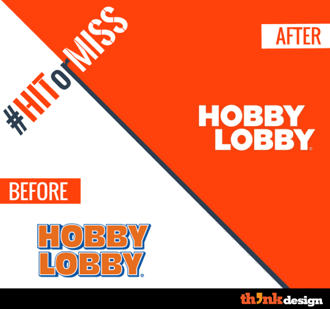
10. Hobby Lobby
Hobby Lobby is an industry leading retailer offering more than 70,000 arts, crafts, hobbies, home decor, Holiday, and seasonal products. Their recent rebranding is under scrutiny these days. What do you have to say about its alignment and visual appeal?
