How to Create a Presentation And Avoid Bad Design

Image Source: Planet Flem/iStock.com
If your business wants to showcase a new product, advertise a new service, or have an amazing presentation at a business conference, a PowerPoint presentation is an effective tool. However, a terrible presentation design not only reflects poorly on your company, potential customers will tune out what you are saying!
Now, if you want to build brand awareness and create a visual storytelling piece, Slideshare is a popular website to expand your reach.
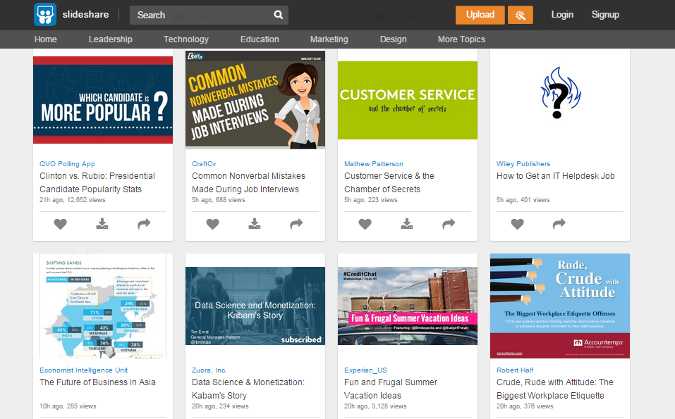
Image Source: slideshare.net
You upload your presentation and share it through social media, email marketing, and if an event has internet access, you can view your presentation after logging in from anywhere.
In this post, we’re going to address how to create your own presentation and avoid the epidemic of bad presentation design. If you’re not a designer, don’t worry – these tips are simplified for non-designers! This is for everyone that has ever created a presentation.
#1 Design your own presentation theme
The point of a presentation is to draw attention to something new or showcase an existing product or inform with tips or tricks. Watch out if you use the built-in theme since it will be nearly identical to countless presentations that viewers have seen in college and their career.
The point here is that something custom makes a much stronger statement. Visual design and visual marketing is all about the message and impression you create. Your colleagues know and use the templates in PowerPoint and they’ll recognize immediately that you didn’t put any work into the aesthetics of the slides.
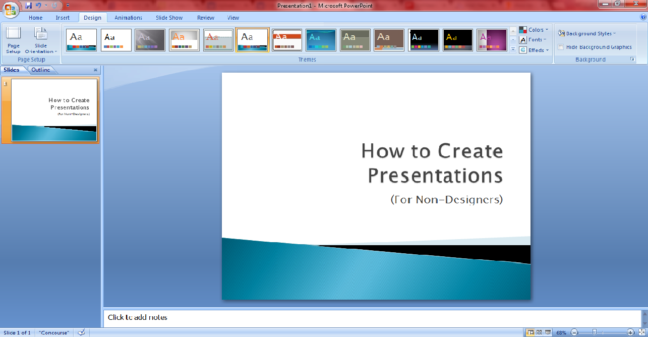
In PowerPoint, you simply go to the design section and change the design color palettes, background colors, and fonts. However, if you don’t want to design your presentation directly in PowerPoint, you have a few options to choose from. One of the most popular platforms that non-designers use to create presentations and other visual content is Canva.
You simply choose presentation, scroll through the different layout options, and customize it from there. There are several options to help you customize each slide.
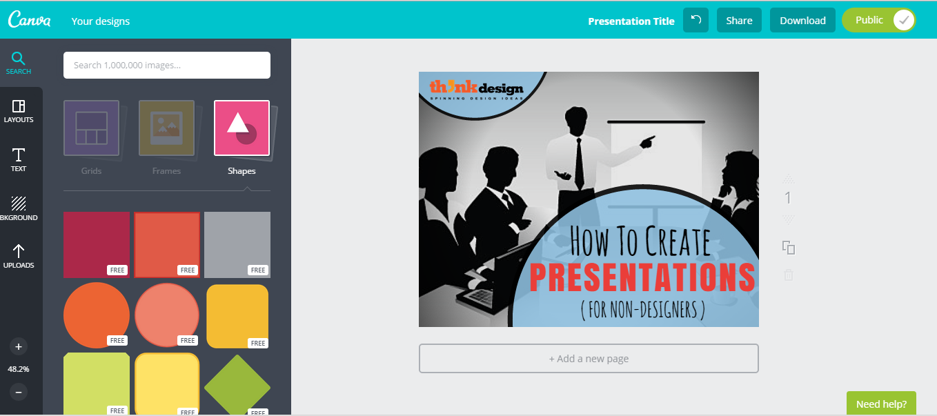
Image Source: canva.com
#2 Create an organized draft
You’ll use this draft as the basis for your PowerPoint presentation. There are a number of ways to do it such as physically sketching the idea into a storyboard, but you must plan the text on each slide. Ensure that you know how to lay out information in the presentation since it will guide the images, graphics, and more.
Super simple draft tips
- Tell a story and drive an emotion – what should they feel?
- Simple points that clarify or support the main message.
- End on a powerful note. Have a grand finale. Incite a call-to-action action.
#3 Remember the main focus
Don’t waste the viewer’s time – get to the point of the presentation quickly; have an intro that is short yet thorough, and after the intro, follow with your main topic. Simplify everything. No lengthy paragraphs of text!
Always remember the message you want your presentation to provide. A presentation is a tool to help you get across your message and convert the viewer to follow your call-to-action.
#4 Avoid terrible stock photography
Photography is one of the single best ways to make your presentation stand out, but the wrong images can make the presentation flop.

Tip: A picture on a white background doesn’t automatically mean it’s a smart photo choice for business presentations. Stop using ugly or awkward photography just to have something to put on the slide!
#5 Choose your color palette wisely
Take care of what colors you choose for the theme of the presentation. Colors that are too bright will distract from the slide’s message, and a lack of contrast with the text color can make it hard to read. A crash course in color theory will help you tremendously!
#6 Fonts matter
If you want your title slide to stand out and draw attention, one great trick is to use a crazy font in a headline while leaving the rest of the text plain. When you have too much of a complicated font or start mixing complex styles, what you get is an impossible to read mess. But if you use it right and pair it with an interesting image and color palette, you’ll have something eye-catching!
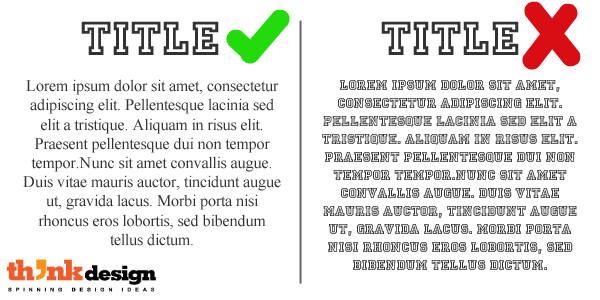
Never be afraid of standard-looking fonts for both your title slide and the rest of your presentation. Using them can help ensure that your design remains in the realm of clean and professional and away from cluttered and ugly.
Visual marketing is essential for success
Presentations created in PowerPoint and shared on Slideshare and other presentation websites are the forefront of storytelling marketing. Companies use presentations as a way to dive into deep personal experiences that products give, rather than only stating what they do.
Design a visually interesting and informative presentation, and your potential customers will naturally follow whatever conversion action that you wanted them to take. It’s a new way to deliver a visual experience and creates higher connectivity with other presenters as well as customers.
If you are not sure if your presentation will convert, find a professional designer to design your presentation for you.