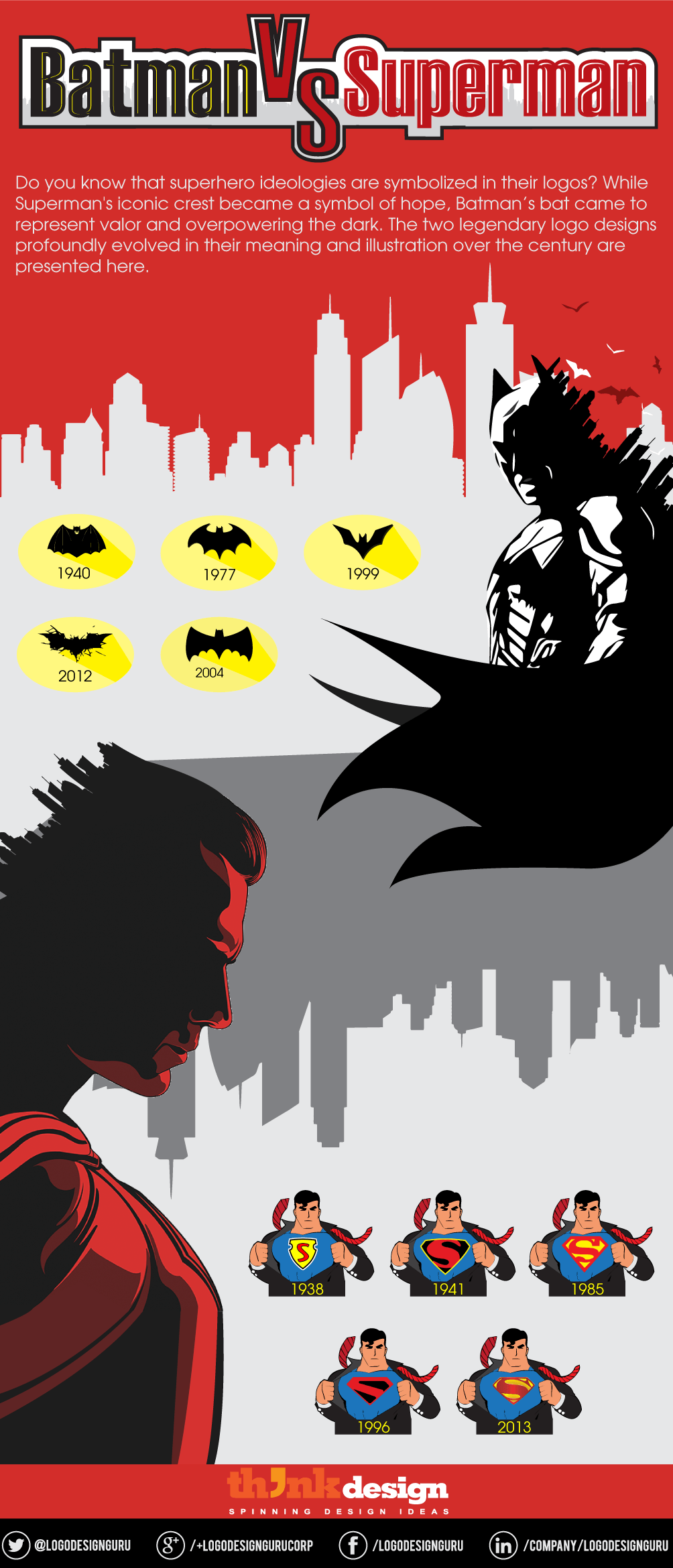
[Quiz] Legendary Logo Design Evolution of Batman vs. Superman
The eternal war between light and dark rages on. It has been the prime focus of super hero comics. The ripples go beyond movies, books, and comics – the crux of superhero messages are illustrated through symbolism in logo design. Closely notice the symbol of “S” in Superman, it shouts out its existence and dominance over all the super heroes through its color and design. It went on to represent hope, healing powers, and even became the family crest of the House of El. Whereas, Batman’s symbol expresses the never failing triumph in the battle against the dark. A close and tough competition between the two is evident from the evolution of their logo designs.
Symbolism carries huge importance in logo design. It communicates deeper meanings that perhaps even words cannot express. It reaches out to the subconscious perception of the world around us. Superman’s logo has been the center of attention for a very long time. The history of superheroes started with Superman becoming an icon and the logo surely tells the story of its greatness.
Batman was introduced as a new type of superhero once Superman became famous. Somebody we could relate to on a more human level. His icon speaks for itself – a bat conquering the darkness of the night. Do you understand the idea behind using a bat as an icon and symbol? Probably the name was Batman, so the bat seemed most appropriate. Nope, it wasn’t that simple.
The image of a bat as an icon bears a deeper philosophy. It is symbolic of how valiant Batman is in the dark. When you are conscious of people’s dark emotions, it is easy to control them. Batman is scared of bats himself, yet he is the vigilante that hunts at night. This is why the bat icon symbolizes ‘overcoming one’s own fear’.
Moreover, Superman’s symbol is made up of bright colors that are associated with his battles in broad daylight. Red is symbolic of power, dominance, and perseverance. On the contrary, Batman’s logo is black – the color of authority, power, and protection. The color of night.
This infographic illustrates the evolution of legendary superheroes’ logo designs.
Batman vs. Superman: Logo Design Quiz
The history of superheroes battling the forces of evil started with Superman, where Batman joined the ensuing war soon after. Both were giving a tough competition – it was also a battle to win over their fans. Let’s see who wins the most anticipated battle of this year.
Are you a logo design fanatic? Critically study the logo designs of Batman vs. Superman and click the one you think is an intelligent design.
Share This:
Embed this Infographic on your site using the html below: