#Whatif Minimal Logotypes Get A Retro Makeover!
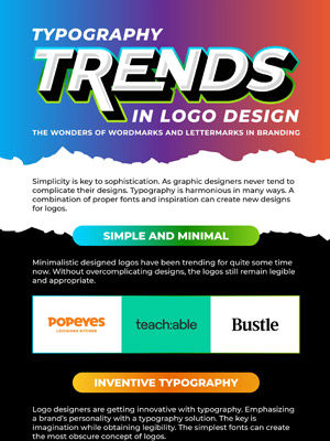
Seeing that most brands are literally “stripping” their logos to attain a minimal look, I thought let’s reverse this process and show you how they look in vintage and retro styles. This actually means how the logo designs will look when we add graphic elements to them such as long shadow, outlines, and 3D effects etc.
In the book, Logo Font and Lettering Bible (2004) by Leslie Cabarga, the author has provided an in-depth study of the “design, construction and usage of alphabets”. At a time, when there weren’t jazzy tools to reproduce typography designs, graphic designers made logo designs by their hands – as in, they used a pen/brush and paper. This gave brands a creative edge and uniqueness, rather than exhausting standard fonts, anybody could obtain.
MINIMAL LOGOS TODAY
If we observe logo designs these days on websites such as Under Consideration and Logopedia, which follow the minimal approach, some are too simple. Obviously, I understand why brands create minimal logos.
It is due to the increasing internet dependency. Yes, over 3 billion people are using the internet to interact with brands via social media and websites. A simple logotype or symbol allows designers to “play” with the logo.
- All companies or brands don’t animate their logos
- On print, a standalone minimal logo doesn’t hit the chord
What do you think?
TRANSFORMING MINIMAL LOGOTYPES
At least I like logo designs with “something to talk about” – those that are dramatic yet functional and contemporary. Logos that have a sense of complexity, nobody can simply recreate.
In Cabarga’s book, I saw many styles like Trilateral, 3D Super FX, Long Shadow, Concentric Lines and Faceted Letters etc. All these styles give a new dimension to a logo – there’s something special, different and interesting about them.
That’s when it hit me, What If Minimal Logotypes Get A Retro Makeover? While I thought it’ll be interesting see these 1900s techniques on some of the latest new logos, it’ll be nice to give a retro or vintage edge to your logo redesign this year.
Have a Blast of the Past and share your views.

Embed this Infographic on your site using the html below:


