Movie Titles Typeface Evolution Through The Decades
When you settle on your seats in a movie theatre with popcorns in your hands waiting for the movie to start, do you notice the fonts? Hardly anyone does. Unless you are a typographer, designer or a lettering expert. However, you will surely notice the use of odd fonts that do not fit the movie title. In fact, the choice of font is crucial because the movie titles have gained the status of marketing elements. Note how movie title typeface have evolved in over a century and it’s not Pokemon evolution we are talking so it will be gradual.
Films started in the late nineteenth century but the mainstream cinema was born much later. From the late 1800s to 1920s, films were regarded as a unique form of visual expression and narrative communication.
Visual communication has always been inadequate without the study of typography. How often have we noticed the applications of typography in movie title designs? Every other movie begins with a title sequence that nestles into the theme or narrative of the story. Although movie title design initially never intended to address this purpose. When it started, the primary and only function was more of a contractual requirement. The movie producers were bound by contract to display the movie title, the name of the director along with the hierarchy of actors and initially, this was seen as an obligation rather than an opportunity.
The title design was not under much emphasis in those times. Today however, movie title design is a whole industry. Customized font design befitting the movie genre has earned great appreciation and prominence in the cinema world.
Font Style
The vast variety of font styles goes on to prove that they have various functions. Let’s take an example where you have to select the font for a sign that says “Do not enter”. This message implies seriousness and might sound like a warning. Hence an attention grabbing and heavy stroked font will be the obvious candidate such as Impact. Instead if the message is displayed in Comic Sans wouldn’t the sign fail to convey its message?
The same is true for movie fonts. Since film titles create the primary impression of the film, their selection is crucial. Sometimes they are created from scratch.
“Geometry can produce legible letters, but art alone makes them beautiful. Art begins where geometry ends, and imparts to letters a character transcending mere measurement.”
Paul Standard
Serif Typefaces
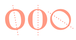
The serif typefaces have short lines at the term of each character. The old style serifs show inspirations from Roman inscriptional or carved writings. The Garalde and Venetian are the more popular old style serifs. The noticeable different is evident in circular characters. The third type is the transitional serifs with horizontal axis of the round characters.

Image Source: Typograph.Her
Sans Serif Typefaces
The Sans serif is literally the opposite and does not involve serifs at the end of letters. Most of the title typefaces in the movie titles currently are from the sans serif category. They have evolved into three main categories such as the Humanist, Transitional and Geometric. The humanist are more towards the classical old style sans serifs. The transitional sans serifs have lighter thickness variations in comparison to the humorists but the geometric or modern sans serifs have no thickness variation.

Image Source: Johnsons Marketing
Mixed
It’s interesting to note that the fonts actually used in movie titles are the mixture of the above mentioned font styles. They started to appear in movie titles by mid-nineties. All the typefaces under this category have pushed the boundaries between serifs and sans serifs to create an emerging genre.
Amalgamation Of Typography And Imagery
The type would appear embedded in physical objects, mimicking different shapes and creating geometrical illusions for the viewer. The fonts selected or designed for this type of combination were usually sturdy, thick and upright. The font has to stand out in a background that is too busy. This amalgamation got more profound with modernism and the font that broke all conventions was Avant Garde. We will discuss how typography evolved in films.


