Personal Branding Goof Ups! 10 Republican Logos That Didn’t Win
Does your logo affect your personal branding as a presidential nominee?
Sure it does! While you may think that propaganda will score you points, you’re wrong if you completely rely on it. Demonizing your competitor and glorifying yourself is a useful technique but when you’re building a personal brand you must get a “good looking” face because hay hair isn’t enough.
But no matter how much we graphic designers stress on making a winning logo, there are always some goof ups that make candidates lose the race. At that time, you say either of these two things:
- “Couldn’t you get an awesome logo from a professional instead of DIY-ing?”
- “There you go! Another brand design failure of the year. Time to scrutinize.”
So it’s vital to make a logo design that is attractive, memorable and triumphant. Nevertheless, some candidates just don’t get this and they face their defeat. These republican nominees could have done a better job but here is why they couldn’t outrun Trump in 2016 election.
Mike Huckabee
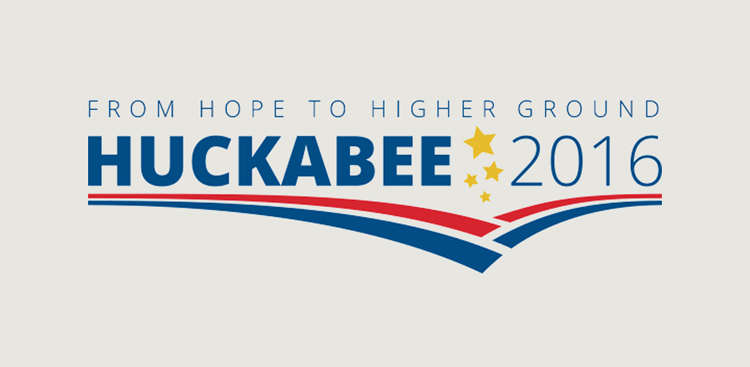
You know this logo design reminds me of an illustration in a children’s book only because the five-point yellow stars are too babyish. What if they weren’t there? I wouldn’t mind that. But then the blue and red stripes could be sued by the Bank of America.
It’s not important to replicate the American flag in your logo. You can take some elements but at least you should know how to make a convincing composition. There’s just too much going on over here; and although the typeface is as simple as Helvetica, the “Huckabee” is too heavy to balance on those thin lines underneath. And mind you, since his logo didn’t have a strong base, his personal branding also suffered.
Moreover, Huckabee’s logo looks slightly off-balance since all the gravity is on one side of the design. As a candidate, you need to show people you know how to maintain equilibrium. This is not happening in his logo at least. I’m just not getting the feeling of cohesiveness in this graphic.
Oh, and by the way when Huckabee accompanies his logo with the slogan “From hope to Higher Ground” – I see those stripes pointing under-ground rather than higher ground.
Tip: To show you’ve got a strong personality, make a logo with design elements falling into place like a jigsaw puzzle.
Rick Santorum
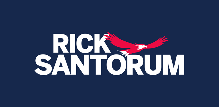
I love eagles, well at least as long as I’m not their prey. Is that what Santorum wanted the American public to think? That they’re his prey. This isn’t an impressive personal branding start off. Anyhow if you focus on the hunting bird, the illustration is abstract; and the drawing could’ve been refined by contouring the overall shape, the feathery wings and the face. If he wanted his personal brand to be symbolic, he should’ve gotten the bird redesigned before finalizing a prototype version for his campaign.
As far as the typography goes, there is nothing spectacular about using a non-customized bold font which I found is Bentonsans Comp or something similar. Why use a typeface that is easily identifiable? Minimalism is undoubtedly an escalating design trend but for graphic design sake, don’t be too obvious and simple.
Tip: If you want to refine your presidential personality with your logo, use well-defined custom shapes and fonts.
Jim Gilmore
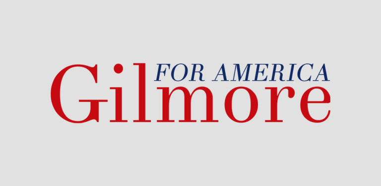
I think this font is perhaps Linotype Didot Roman because the letter “G, in the logo and the font, has an underlying curve like an arch of a foot. There’s no harm in using serif fonts, in fact it is now a fashion to be vintage but Gilmore’s look takes us back to an unwanted historic time.
I would say that as compared to his 2008 logo, the 2016 design is way better. It is an oldy-goldy font in red which proves that his audience includes baby boomers or silent generation and not millennials. You tell me, if there are any experts reading this, what more can I say about his logotype?
This is a perfect instance when you wouldn’t mind the client saying, “Could you do an actual logo instead of a font?”
Tip: If you want to look old in 21st century, give a serif font a creative modern spin by using trendy typefaces.
Also Explore: US Presidential Slogans Gone Wrong
Jeb Bush
Hey look! It’s me, myself, and I. It’s too pretentious especially with that exclamation mark.
John Ellis Bush abridged his name to Jeb and used it as his personal branding logo for this year’s American presidential race. The logo design with his acronym and the punctuation mark has remained the same for over two decades as shared by CNN’s Andrew Kaczynski.
ICYMI: Jeb Bush debuts his campaign logo: pic.twitter.com/tB4IFoP1ie— Jeb Bush (@JebBush) June 14, 2015 http://t.co/IyvNo4dPtD
— @PRWeekUS (@PRWeekUS) June 15, 2015
In the 1994 campaign, he lost to the Democratic governor Lawton Chiles and it’s rather foolish to make a comeback with the “cursed child”. It’s not a good omen to use the logo with which you lost.
In fact, someone on Twitter thought his logo looked a bit like that of Big Lots. A bold font overpowering a light one and everything comes to a halt with an exclamation. I wonder if this was his inspiration because the store actually opened way before Jeb even came into the political scene.
Phew, I figured out what Jeb Bush’s 2016 logo reminds me of… #biglots #deals #politics pic.twitter.com/oSdAM4i8VX
— Elizabeth Cherneff (@echerneff) June 15, 2015
I feel the exclamation mark is simply boasting his harsher self. After the notorious George W. Bush the idea of overconfidence and bragging should’ve been avoided by Jeb!
Tip: The election isn’t just about you, so when you make a political logo for your personal brand don’t be full of yourself.
John Kasich
Okay, hang on! The red stripes with the “K” remind me of something [thinking]
The Wella shampoo logo.
Sagi Haviv, an award-winning graphic designer suggests “strategically it’s right on the mark, but execution wise its leaving me wanting a little bit.” I don’t want “a little bit”, I actually would like to delete a bit. The use of double “K” is killing the overall appeal of the design.
What could he have done with this design? The K with stripes alone would’ve been incomplete and confusing. On the other hand, “Kasich” alone would’ve looked too meek to be called a logo. So I spent some time wondering about the design and this is how I twisted things around a bit.
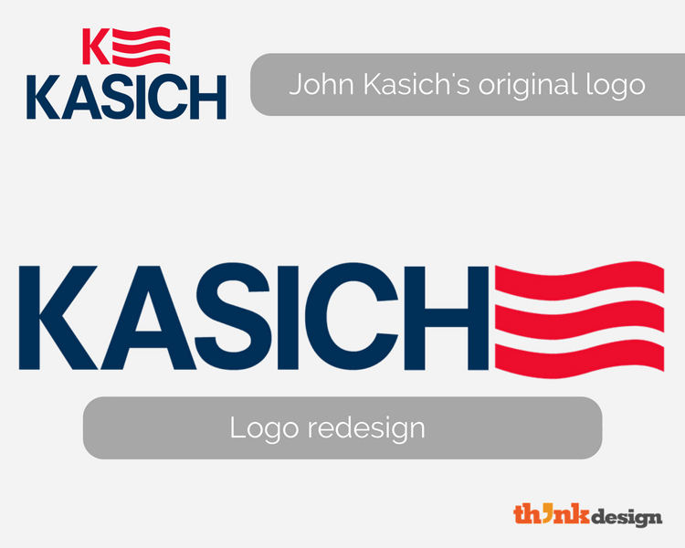
See! He could have done it without the twin “Ks”. What do you think?
Tip: When designing a logo for your personal brand, don’t be redundant by repeating design elements.
Carly Fiorina
That is not all! This logo design is similar to that of Macy’s, the popular US department store.
Come on people where is originality? In a swarm of logo designs I see so many duplicates despite the fact that we have a gazillion unleashed graphic designers with unconventional ideas. I’m sure Fiorina didn’t want anyone to link her personal brand to a store.
This is the problem with minimalism – everyone looks synonymous.
Tip: when making a logo for yourself, make sure it reflects you and doesn’t resemble something totally unrelated.
Rand Paul
The Creative Director, Richard Westendorf of Landor Associates remarked, “This looks as if it was dashed off in PowerPoint by a staffer”. Unlike Westendorf, I wouldn’t be too harsh with this logo design. I’m actually impressed to see the use of negative space in a political logo while other candidates of 2016 actually went with that ‘made by staffer’ look.
Although a torch is a symbol of liberty in America and it is also used by Ted Cruz in a different manner, the icon reminds me of the Olympics. Westendorf said that Paul should, “Ditch the torch, keep the strong wordmark” to which Milton Glaser agreed that the flame is bland and generic. Paul’s torch doesn’t suggest why he incorporated it in his logo and what aspect of his personal brand the symbol represents.
Oh and switch Rand’s name around, it sounds like that of the iconic graphic designer Paul Rand. He would’ve guided this failed candidate on his logo to win the hearts of more voters.
Tip: Develop a logo for your personal brand that’s easy enough to understand and remember, but hard enough to copy.
Bobby Jindal
There are quite a lot of things wrong with this logo that made the design a complete loser and obviously affected Jindal’s personal brand. Following the announcement of his logo, Twitter overflowed with funny and sarcastic comments and redesigns.
First off the “J” in Jindal’s logo is basically the highlight of his campaign. Although it is just another alphabet, it looks like a rather fat candy cane.
Jindal’s candy cane logo was better in the original ” ਯ ” pic.twitter.com/QFUOyLBSB7
— Manish Vij (@manish_vij) June 24, 2015
Others felt that the “J” reminds them of the “O” from Obama’s campaign.
Bobby Jindal’s logo looks familiar. I wonder what it would look like if he used both his initials. pic.twitter.com/YKCezP6Sey
— Eric Grant (@ericgrant) June 24, 2015
I feel that the “J” has too much on itself. Is Jindal all about the American flag? I don’t see his personal brand reflecting through his logo design. As a voter, I’d like to know:
- What “J” is all about?
- Why I should vote for him?
- What will he do for me?
For example, the logo of Hillary Clinton of the Democratic Party is also a lettermark but the arrow is tactfully placed to complete the letter “H” and to signify the “moving forward” ideology. But in Jindal’s logo, I can’t see the point of the design.
Tip: If you’re using an element of the country in your political logo, don’t forget to balance it with an element of your personal brand.
Lindsey Graham
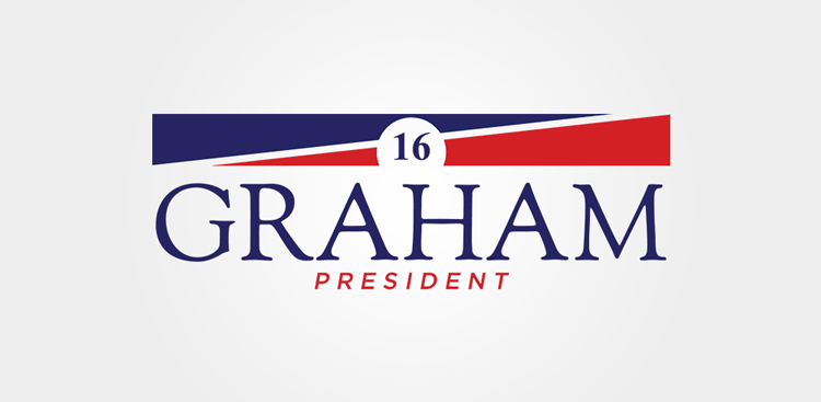
I thought only Lindsay Lohan is suffering from an identity crisis whereby no one ever knows what she’s really like. Another victim of a wavering identity is Lindsey Graham, a 2016 presidential nominee who lost the race long before.
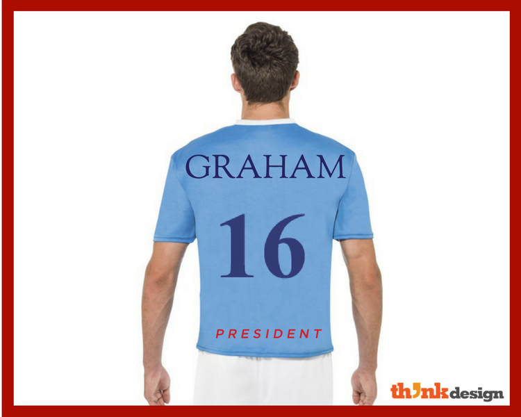
The first thing I’m puzzled about in this logo are three things lying in a vertical hierarchy: “16”, “GRAHAM”, “PRESIDENT” – what is this supposed to mean? These three elements are composed in an unconnected way. I mean there is no conjunction like “for” to couple with the word “president”, plus the “16” looks like a number on the back of a football player’s t-shirt.
Now this one looks like it’s made using a free logo maker because there is nothing smart or symbolic about it. The serif and sans serif font combination is as tasteless as a graham cracker. The two triangles of top serve no purpose and say nothing about their presence in the design.
This logo would look great on a cigarette packet, the invisible rectangular circumference reminds me of Marlboro. For a presidential candidate, Graham could’ve reflected his entertaining personality.
Tip: Be more creative when designing a logo for your personal brand since it is your face and you don’t want to look ugly.
Ted Cruz
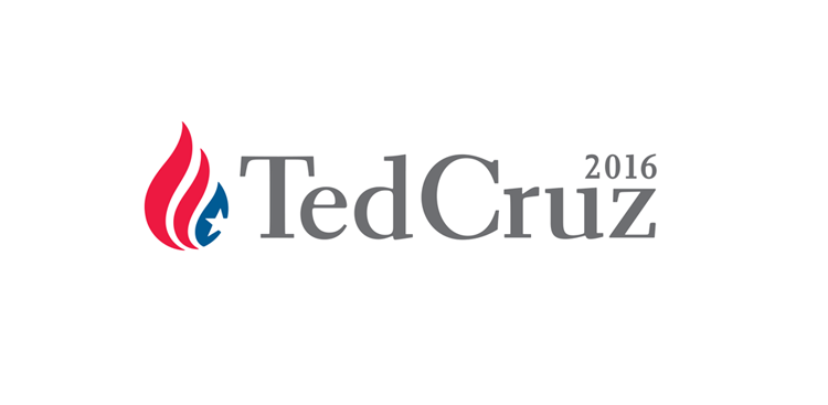
I’ve had enough of this cliché flame symbol and I’m not the only one. While Milton Glaser questions whether Ted Cruz wants a burning flag to be the center of attention, Debbie Millman thinks the logo is ho-hum, terrible and predictable.
Apart from looking like an upside down American flag, the flame looks a bit like the Cuban flag with stripes and one star. Dianne Marshall of the blog The Marshall Report thinks that the Cruz’s logo only reversed the colors of Cuba’s flag and the logo design pricks on the issue to merge Cuba with the Western Hemisphere. It is something to wonder.
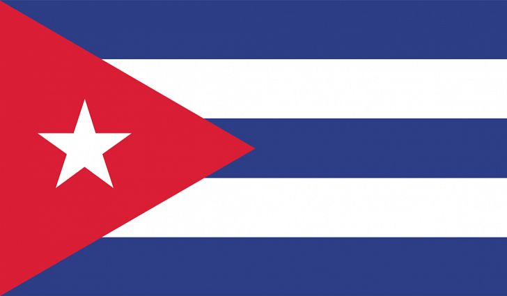
Image Source: World Atlas
On the other hand, the symbol also looks like a droplet; and the shape resembles some other existing logo designs.
Ted Cruz’s campaign logo looks so familiar. pic.twitter.com/XsWYau105R
— clydetheslyde (@clydetheslyde) March 23, 2015
If Cruz removes the flame/droplet, his logo is just his name in serif font and there’s nothing exciting about it. None of the design elements on his logo can look good standing alone and even together they’s a mismatch.
Tip: If the colors have to be red, blue and yellow but be innovative when creating a symbol for your personal branding.
You tell me, will Trump be on this list in November?


