10 Brands That Ought To Redesign Their Logos In 2016
Feature Image Source: iStock.com/leolintang
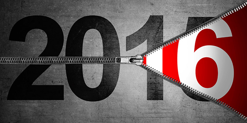
Ah what a year it has been! From major logo redesigns such a Google, HeinzKraft, etc. to minor rebrands like Facebook, it seems like everyone is in a rat race to present their logo concept and get it imprinted in the minds of their customers. In 2015, brand rivals followed each other zealously just to get in the limelight. They occasionally shared a bit of the publicity but not always for a good reason. While the urgency to get noticed is understandable, how can anyone forget that the customers will never forgive them for sloppy attempts?
As a result, some ideas backfired. Having seen numerous logos revamped during the year, we feel the following brands ought to redesign their logos in 2016, if not for the sake of rejuvenating their brand image then at least to make their customers happy. We know for a fact that the potential audience is going to analyze logo designs critically especially if they are loyal to a given brand. You still have a chance to set things right. Check a drilldown of logos that need to redefine their logo identity by the end of this year.
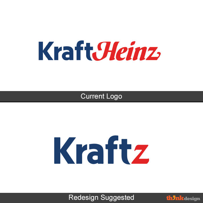
HeinzKraft
It was just last year that the two brands merged. In the logo design that came up, each brand retained its individuality primarily because they did not want to lose their loyal customers. However, now the world is aware of this unexpected merger. This is the right time to come up with a substantial and long-lasting brand identity, perhaps like this:
AOL
AOL’s new logo design with a period is too clichéd and appears to be a product of old-school thinking. Perhaps they are of the view that sticking to a font similar to Helvetica is a safer option. However, they’ve over-looked the fact that negative space logos are over-used hence they appear unprofessional. It’s high time, they change the word mark appearing in negative space.
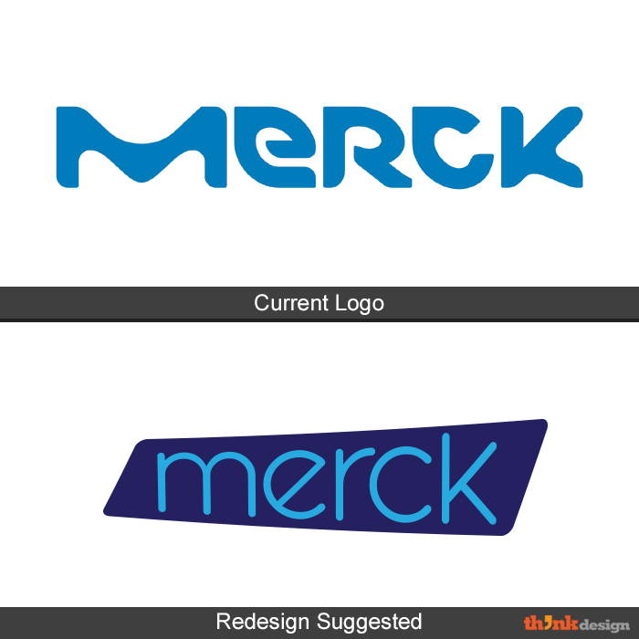
Merck
If I were to describe Merck’s new logo in one word, it would be “suicide”. The underlying concept is ahead of its time and hence purely experimental because the audience is not used to seeing so many colors and imagery in the brand identity of a pharmaceutical company. It looks like we are back to the 60s featuring psychedelic designs. The colors are somewhat acceptable but the choice of font especially with an extended ‘M’ ruins the show. Merck appears to have tried to link to microbes but the previous logo displaying the pattern of a chromatogram perfectly explain the business. As for the new design, only a limited section of the science community will understand the branding and logo. The rest will just scratch their heads and name it a design from the media industry.
For now, it seems like a run-without-a-test experiment. If they are smart to pick up cues from the market, they will think about rebranding this year.
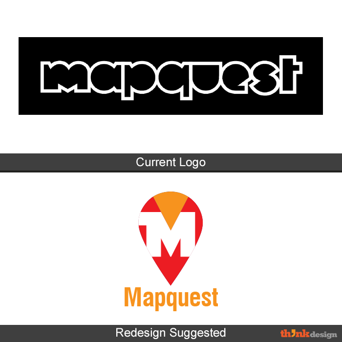
Mapquest
Another example proving that you will be penalized for getting your “m” wrong. The insertion of different icons between p and q works but that doesn’t mean that whole logo has to be an outline. This logotype has zero visibility if you view it from an arm’s length. As the name suggest, Mapquest is a location finder that allows us to figure out how to get to places. It seems to have picked a logo design that was dropped by Airbnb.
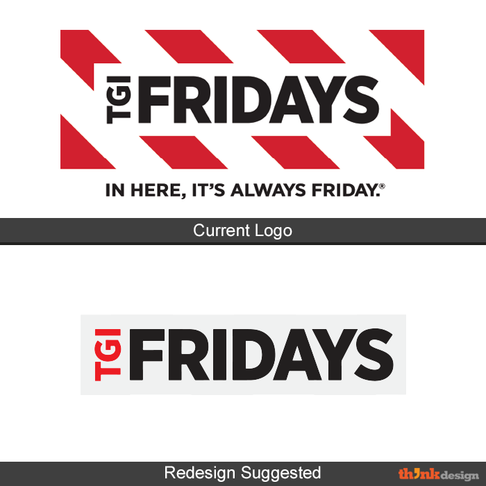
TGI Fridays
The trademark color schemes and stripes depicted in TGI Fridays are retained even after the logo tweak in 2013. When they were about to create a logo design in 2013, it was expected that they will give up the stripes. Though the geometrical placement of the logo has improved, it still gives an impression of the psychedelic 70’s era due to these hypnotizing think stripes. Apparently, it seems they are aware of the stripes aversion among the masses and plan to eventually drop the stripes. In 2016, they might reduce the stripes to one letter and then give it up altogether.
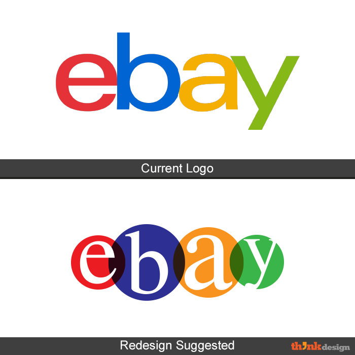
eBay
When eBay changed their logo for the first time after 18 years, it received mixed opinions. Some said the new logo was much needed, others bashed it completely, saying it was dull. Among all the criticisms, one thing was certain: eBay needed a fresh logo. They did an experiment once and they can do it again. Share your comments if you feel eBay needs to change their logo this year.
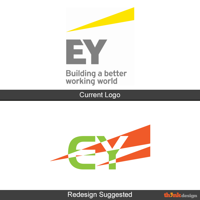
Ernst & Young
Ernst and Young is a renowned accounting firm with a global presence. Their current logo gave up the names and reduced the logo to initials only. The color pairing of grey and yellow is remarkable but the “wow” factor is still missing for a firm that big. Hence, a slight change of color is in order.
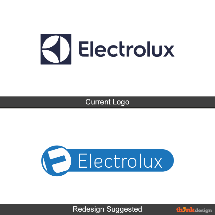
Electrolux
When it comes to product designs, this electronics brand has maintained a class but the same cannot be said of its logo. That’s right folks, Electrolux is also on the list of brands that ought to change their logo in 2016. Electrolux recently has changed their wordmark and color which has earned it a lot of criticism.
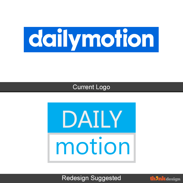
Dailymotion
Dailymotion has recently come up with their new wordmark logo that completely gives up the tower. It uses a sans serif font with neatly overlapping letters. Despite the neat graphics and font, it doesn’t quite convey the message of the brand. It’s resemblance to Adidas can also be the trigger to modify the existing logo.
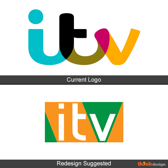
ITV
Fans believe ITV went from sober to ugly. The new identity is a total transformation that paints a totally different picture about the channel. As for the new logo, it distinctly represents a light-hearted magazine rather than media portal that also covers some serious topics. If they mellow down the colors or use a somber palette, leading towards a monotone approach then they can totally pull it off.
How would you like to see these brands redesign their? Share your thoughts with us.
Current Logos Source: Brands of the World™