Deciphering Shape Psychology for Graphic Design

Image Source: vectorstock.com
Have you ever wondered why the ‘M’ in the McDonald’s logo has curved ends or why the Nike Swoosh has such a dynamic line? Why is the Delta logo so angular while the Starbucks logo confines its lines to circular?
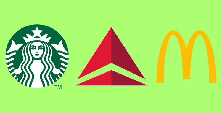
Image Sources: starbucks.com, delta.com, mcdonalds.com
If you are the average Joe the thought has probably never crossed your mind. Unfortunately, graphic designer’s (poor chums) have these sort of wild thoughts all the time. It’s what makes them ‘different.’ However, it also makes them creative and able to design a more insightful logo or web design. The fact is that while not many people give importance to the shapes, angles, and lines that are used to create their design (logo or web), in the end, the shape of the design can influence the emotions of an audience in a subtle way.
To Contour or not to Contour
The best designers will understand not only the color psychology and the science of choosing fonts but also the psychological dimensions of shape. Many people will laugh outright at such a statement but knowing how to permeate the sense from the nonsense within psychology will help you create a buyers perspective to design.
To a client, a button on the website that is square, can have a curved contour or an angular one, it really makes no difference. Actually odds are they will not even notice the contours (being more focused on the images or color). Nevertheless, the shape is an essential facet of influencing the target audience towards specific emotive reactions.
Buyer/Seller Insight vs Design Elements

Image Source: neilpatel.com
The economics of a product or service is the most essential facet for a buyer and/or seller. They are focused on the risk, the strategy and the politics of a business cycle even when they hire a designer to craft their logo, web design or any other graphic design element. They think with, as psychologists are apt to say, with the left part of their brain.
However, marketers and designers living in the 21st century have to be more versatile and think with the left and right part of their brain. They have to ensure that they take into account not only the buyer/seller’s left brain needs but also their emotive perceptions. The attitudes, behaviors, and socio-political influences have to be considered so that the audience can be guided to take specific action.
The obvious elements are color, font and images. On the other hand, shapes are also an influencing facet of influencing buyers and sellers.
Using Shape Psychology to Guide Audience Emotions

Image Source: clipart-library.com
Circular: Shapes that have circular lines generate a positive response within the emotional response centers of a person. When people see a circular line within a logo design they unconsciously relate it to the community, friendship, and love.
The oval and circle suggest sturdiness, endurance and stability which is why a lot of car companies like Ford and Kia have a logo that is enveloped in the shape of an oval.
Ellipses tend to evoke a sentiment of support and innovation and brands like Toyota, Oakley and others take advantage of this by portraying their logos using ellipses.
Rings project partnership and unity and logos like that of the Olympics and Audi amplify this emotion. The use of specific colors can create a powerful message for example the Audi logo is silver in color which suggests sophistication and elegance along with endurance and unification of lifestyles.
Angular: Shapes and straight edged lines found in squares, rectangles and triangles suggest professionalism, efficiency and stability appealing to the left brain of the audience. They create a balance of practicality and if combined with colors like red and blue can evoke a perception of dynamic modernization.
Financial logos, banks, and real estate firms make use of this to create logos (Barclays and Chase) that define stability and practicality.
The use of squares and rectangles in graphic design creates a perception of power and strength. Combine that with rounded contours and you have a sense of balance and reliability. Precision, efficiency and humane values depicted in design simply through the use of a shape.
Triangles and Pyramids are associated with scientific and religious theories. Use of triangles within design work well for industries within these fields as it creates a sense of power and reliability.
Linear: It’s astounding to realize that even the direction of a line can impact the perception of the audience. Maybe not so astounding when the visual impact is considered (vertical lines on clothing makes you look taller and slimmer).
Vertical lines impact the mind by creating a subconscious association with aggression and masculinity. Vertical lines suggest strength and sophistication.
Horizontal Lines on the other hand create a sense of calmness and Zen tranquility. They project a natural sense of balance that can be used to influence audiences.
Angled Lines represents a feeling of energy and dynamic movement. The use of an arrow to show direction, the implementation of a check within a design creates an emotive response in people that can be rapid and energetic.
Curved Lines on the other hand have a more feminine reaction suggesting happiness, generosity and sense of rhythm. They evoke pleasure and used together with some angular lines can present a sense on innovation like that in the Nike logo (swoosh).
Implications of Using Shape Psychology in Graphic Design

Consider this, you know that the color red suggests energy and anger. You utilize that emotive reaction and combine the color with a typeface that is curved and cursive softening the reaction and decreasing the aggressive appeal. The soft rounded letters appeal more to the women while the color red attracts the aggressive male. A perfect balance.
You want to design a ‘call to action button’ that makes the audience react. You have to consider the shape of a button carefully, the contoured curved corners of a square button will make people focus on the content while the angular edges will cause the audience to focus around it. The audience is genetically engineered to react unfavorably to sharp edges it is in psychological terms called the primordial reaction as it is seen as threatening (think knife).
Visual perception is important in evoking reactions in the audience the cognitive effort it takes to react to angles is more aggressive than when reacting to rounded contours. Surprisingly, the “fovea-eye” reacts fast to circular shapes than angular ones.
The implications of using shape psychology for graphic design then becomes simple. You have to as a designer and marketer be able to create a coordination of color, typeface and shape to project a design that perfectly emulates your audience reactions.