Summer Olympics Logo History: 1992 to 2012
Image Source: freepik.com
The 2012 Summer Olympics are just around the corner. London, the only city in the United Kingdom to have ever hosted the Olympics, will soon become the only city in the world to have hosted the modern Games of three Olympiads.
As the world eagerly anticipates the event and what the future beholds for participating Olympians, one must also appreciate and acknowledge the history of this event. Olympic logos are as popular as sports logos and one of the most anticipated pre-Olympic events that people the world over look forward to. Every Olympic event is associated with its very own logo. Today we will look back into the past at some of the most elegant summer Olympic logos created over the last decade.
Barcelona Olympics 1992
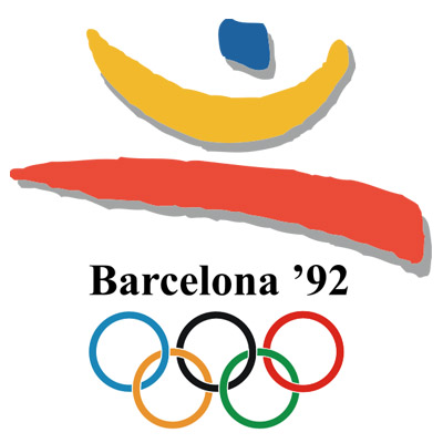
Image Source: olympic.org.nz
I was only a teenager when the Barcelona Olympics were taking place. This was a very special event for basketball fans. It led to the creation of the ‘Dream Team’ from the United States, which sported their best players from around the country. This logo was my first introduction to the 5 Olympic rings and the first time I learned about Barcelona.
Atlanta Olympics 1996
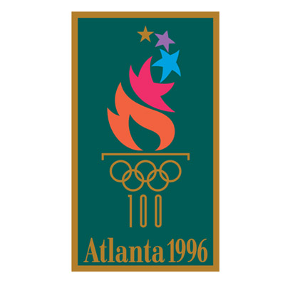
Image Source: www.olympic.org.nz
Atlanta trumped Canada to win the bid to host the 1996 Summer Olympics, marking 100 years for the event. The 1996 Summer Olympic logo bears the number 100 to mark the occasion, as well as the lit torch to commemorate the torch lighting ceremony performed at the beginning of all Olympic Games. “Summon the Heroes” was the official theme for this Olympiad.
Sydney Olympics 2000
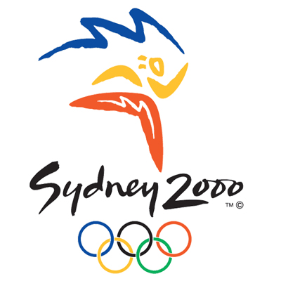
Image Source: olympic.org.nz
Personally, this is my favorite logo. I find it very appealing. The logo keeps up with the tradition of the 5 rings, customary with Olympics logo in general. It uses a stylish font and if you look carefully, you can also see the image of a running athlete.
Athens Olympics 2004
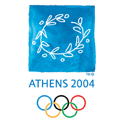
Image Source: ShaunBotterill/gettyimages
The Olympics returned to Greece in 2004 and immediately one of the niftiest of the summer Olympic logos was created. The image in the logo is that of a laurel wreath crown (traditionally a gold-leafed crown) originally worn by King Phillip, the father of Alexander the Great. It was a great way to commemorate the event and an elegant mix of style and history.
Beijing Olympics 2008
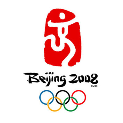
Image Source: chine.in
China hosted the Summer Olympics in 2008 and like their predecessors; they too had a superb event. The logo is an emblem of the traditional Chinese seal, representing the spirit of the games through the union of the image of an athlete and the Chinese calligraphy style font. This makes it one of the most unique logos.
London Olympics 2012
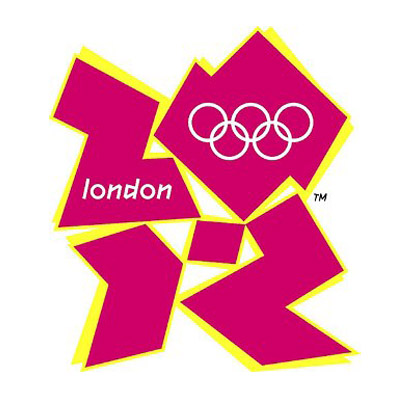
Image Source: AFP/gettyimages
I have to confess, this is my least favorite logo of the lot and it has made it to my list of logo disasters. In fact, I was in utter disbelief when I first saw it. While the designer tried using the number 2012 in a creative way, I find the logo lacking on many levels. The color scheme is poor, the font unattractive and the style is unappealing. It is certainly not one of my favorite Olympic logos.
What do you think of this Summer Olympic Logo collection?
Do you have a favorite?


