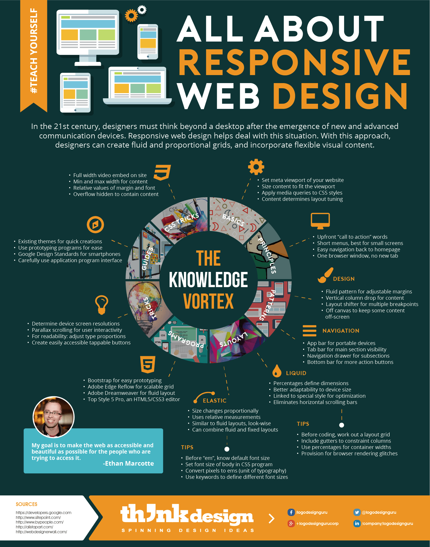
#TeachYourself: All about Responsive Web Design
Among the global portable device users with internet connection, 46% report problems in viewing static websites, meaning fixed layouts. Moreover, 44% claim that in non-responsive websites, navigation is challenging on devices like mobiles, tablets, laptops etc. Additionally, over 40% smartphone users mostly use their phones to go online essentially for quick browsing.
Considering this trending transformation in the web industry, it has become vital for designers and entrepreneurs to create websites that can be viewed on all devices with ease. After much development from 19th to 20th century, the 2000s has emerged as the epic century for fluidity and adjustable design plus content. This is due to the fact that 60% of internet users access the web through portable means.
Defining Responsive web design RWD
Coined by Ethan Marcotte in 2013 in his article “A List Apart”, responsive web design (RWD) is becoming increasingly popular in usage as well as in criticism. It is a method for fashioning websites to deliver optimal interaction, viewing and design experience. This includes easy navigation and reading with minimum scrolling, panning, and resizing across an array of devices.
Why Use It?
A thing to note here is that Google has sort of a monopoly over search engines and as of January 2015 the portal has 64.4% market share. Seeing this, it’s a plus for brands to consider responsive design as a solution to get recognized by this popular browsing site as RWD is SEO friendly in many ways. Google recommends such websites to portable devices.
Moreover, responsive websites prove to be easy-to-use because they take the shape of the screen; and also the content correctly adjusts to different sizes. Although there are issues and myths regarding the use of responsive design approaches, on a general basis it does help leave a good impression within 10 seconds.
Learn how to create good responsive web design to provide rich user experience that will make up for 4xx User Experience errors online. There’s a lot to grasp about this approach — this infographic is packed with loads of easy-to-understand information for you to start off.
Who Is It For?
In an ever-changing world, responsive web design is a good option for emerging businesses and aspiring designers. Why?
- 46% smartphone users reject sites with navigation problems
- 33% phablet users dislike poor performing company website
- 52% online buyers, “page loading liable for website loyalty”
- 45% users face sites that don’t function as expected
Hence, it’s crucial to understand the web design industry requirements, its trends and tricks. See how you can make your website functional and visually attractive with responsive web design.
Start learning right now by clicking on the below infographic
Share This:
Embed this Infographic on your site using the html below:
