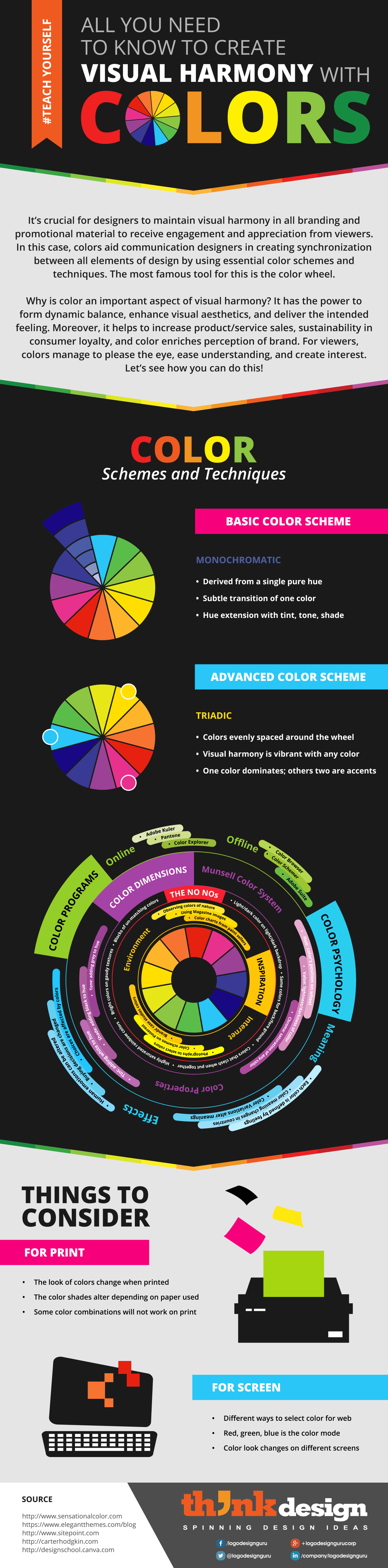
#Teachyourself – All You Need to Know to Create Visual Harmony with Colors
Colors are important to human existence as they have the power to influence our emotions, mental decisions, and physical actions. Have you ever loved a color so much that you bought anything exceeding your budget? I have. A study “Impact of Color on Marketing” by the University of Winnipeg concludes that preliminary rulings about products depend mainly on color.
Thus color isn’t simply a designer’s artistic choice, but is a vital decision for the growth and sustainability of a business. It affects perceptions of consumers about your brand’s image, product or service; and consequently its sales.
Importance of Colors
The choice of color has influence on the viewer (potential or existing customer), the design (logo, websites, stationery, advertisements), and business (its values and ideas).
While color is important in all fields, the importance of it in branding is unimaginable. Designers do thorough research before deciding colors that will help produce a harmony-filled visual. Hours are spent on deciding what will look nice together and what will have an impact on people.
Choosing Colors
There are several options available for you to choose a perfect color scheme to create visual harmony in your design — the logo, brand stationery and marketing visuals. You can use the symbolic and traditional methods, or you can use contemporary and digital ways.
Color schemes can be derived from the color wheel, color picking programs, and inspirations available around you. The most important tip to remember here is that you should use colors that: a) define your brand and its idea, b) synchronize an entire visual, and c) prompt a positive decision or action.
Things to Avoid
Once you are done choosing the colors that best serve your purpose, the next step is to decide how to place them together on a print or web canvas. The infographic suggests tricks that you can use to avoid any goof up when using your color scheme.
You will find how to create harmony in your design by using correct methods involving the foreground and background; also the ways to make appealing color pairs.
Things to Remember
In the field of design, it is essential for all designers to know the difference between and print and electronic media. This knowledge is crucial when picking a color scheme for your design to create harmony as it all depends on two color models: CMYK (Cyan, Magenta, Yellow, Black) and RGB (Red, Green, Blue), respectively.
From this infographic, you will learn exactly why it is important to segregate the methodologies for picking colors for any printed material (magazine ads, pamphlets, posters, brand stationery), and electronic material (websites, videos, television). It will tell you accurately what you must keep in mind when making a decision on colors, in general. Remember, this can affect your final outcome; and after so much hard work, you don’t want to mess things up.
Read this infographic to discover more about visual harmony via colors.
Share This:
Embed this Infographic on your site using the html below: