The New Bacardi Logo – It’s Five O’ Clock Somewhere!

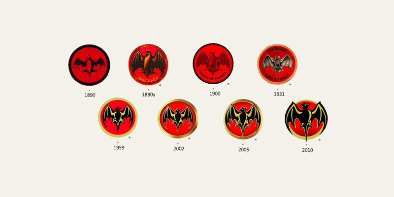
Image Source: designtagebuch.de
When researching the liquor market one is amazed by the saturation of the brightly colored labels, and bottles offering you any variety of fantastic experiences and emotions. It’s a competitive industry for any logo design, but the Bacardi Rum image really shakes the industry good despite the common problems that most logo redesigns face.

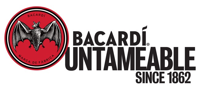
Earlier this year the company elected to focus on their age and established presence, rolling out a new advertising campaign comprising of references to the drink’s durability as a brand and a new logo that perfectly illustrates their new direction.
Aging the Image

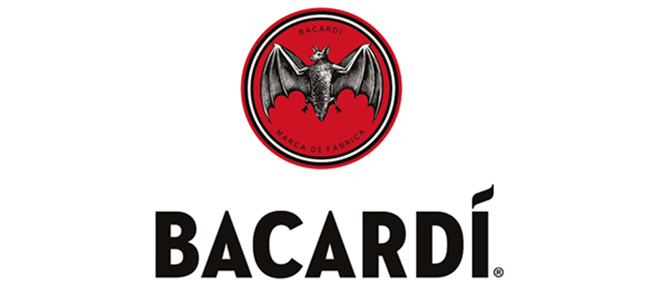
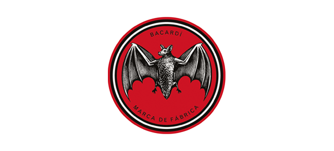
As a brand that focuses on the age of its product, the new logo redesigns the bat mascot and the words embedded in the design. Far from the stylized cartoon in its last iteration, the new bat minimalizes the color scheme to a black and white with a lot more detail. The wings and body, eyes and even feet are all easily recognizable more as a photorealistic sketch than a unique mascot. This draining of color and addition of detail give it a sense of coming from a different time, certainly different from the age of dramatic colors and high stylization that currently graces the artistic world. That, in combination with the words Bacardi and Marca De Fabrica tracing the more emphasized make it look like an emblem of olden days gone by.
Typography: Branding Respectability

Respectability is a surprisingly simple thing to achieve in a logo design, because in each era of design choices there’s something that appeals to that sense of establishment and age. Bacardi combines this with a new sense of professionalism from their move to a Sans Serif font. The weight borne by the new logo image creates an interesting clash of old age elegance with new-age respectability in the form of its bold font. The focus on Bacardi is much more prominent and the fluidity of the letter design leaves little space for flair. The little ‘i’ gives an extra little punch at the end, and along with the particularly angular quality with the two‘As’ setting a fun reminder of their “Untamable” brand aspect.
Something to Remember
Bacardi has done something particularly interesting here, especially for a rum. The move to this more straight-laced style of logo puts them almost in direct opposition to the classic rum style. Typical rum logos attempt to create an exotic feeling with irrepressible modernity.
This Bacardi logo, specifically the typographical choice, looks much more like a vodka image. It’s an interesting move that combines familiarity with uniqueness. Go to any drink display and these fonts will be seen expressing a bold cleanliness that makes drinking rum almost respectable (at least among the people I communicate with). However, the best part is that in the rum section of the shelf, it’s going to be unique. Next to all of the palm trees and pirates this simple yet memorable logo will appeal to the millennial crowd that accepts respectability and slick new professionalism. With this move Bacardi demonstrates a sophisticated understanding of the way they want to advertise their brand and the way they are targeting their audience.
Bottom Line:
The Bacardi logo is a bold move in a competitive industry and within the various established brands the company shows it’s not afraid of competition. Time and age is extremely important for any target audience or any reputation that may need to be built. Respectability is paramount, whether it is built on whimsy or seriousness.
It is whimsical sophistication that maintains your authenticity, as well as your credibility in the face of critics and fans alike. Lastly, a complex understanding of how your business is marketed and sold is always required for a logo change. Changing the face of your company will change the way your products are viewed at every level of the market process, and Bacardi shows a great example of how that can be done right.
We are officially trending #featuringthisweek and #zilliondesigns on twitter – following this week’s theme #rebranding. You can join us in promotion.


