Timeless Wordmark Logos And Their Story Of Success

Feature Image Source: jessicajonesdesign.com
Giving character to characters: typefaces have a Jekyll and Hyde effect on words, and today the range of personalities available is greater than at any time in the past. It means the same font can show a vastly different character when used in one logo to another.
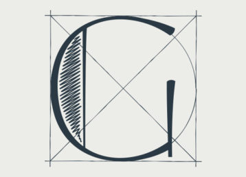
The most crucial role for a designer is to understand how to achieve expression through type. In the most practical terms how can you make the word ‘fizzy’, look fizzy? For this, you have to go back to the sketch board and craft an idea that conveys the brand essence in the wordmark. Sounds tricky, doesn’t it? Indeed creating a logo that stands the tests of time is a challenge.
The arrow in the FedEx logo – people love having that pointed out to them. That kind of feature makes every client and every customer happy. And that’s what you’re always reaching for: that special element where the penny drops. Hence expression through type requires perfecting the fonts or rather customizing them.
It’s All In The Font
Before computers, a font was called typeface or face. Font originally referred to the product of a foundry where hot metal is poured into molds, and type font referred to the complete character set in one specific point size and style of type within a type family. Now font has become revived as the term for any computer typeface sold, traded, pirated or offered for free.
A word or an abbreviation set in a typeface chosen to convey something of the nature, stature of character of the organization. It is where the focus falls squarely on the letterforms themselves and on the communication of basic, essential values through type. It is where logotypes most closely follow typeface fashion, and where simplicity can lead to longevity.
LogoTypes
‘An identity in its most basic form is a name. The next layer is the way you present it. That’s the clever bit: conveying a message through a name. If you can build an identity in black and white, with just the name and something going on inside it, that’s the holy grail.’
Logo design in today’s world has taken limitless forms and styles and that broad range of style has more acceptability. The logos are more concept driven that covers various categories. For instance the “literal logo” is simply the nameplate of the brand whereas retro logos are appreciated by the Victorian art fans. Among the various styles of logo designs, wordmark logos serves multiple purposes.
- They present company initials in graphical form
- They make the logo look basic and legible
- And brings a unique dimension that makes the logo unlike any other
Eventually the logo becomes the permanent identification and the mass audience starts associating the brand with it. The importance of selecting the right type for a logo cannot be overstated. Here’s an outline of different custom designed fonts for creating timeless logos. Check out how some logos are everlasting despite their simple construct.