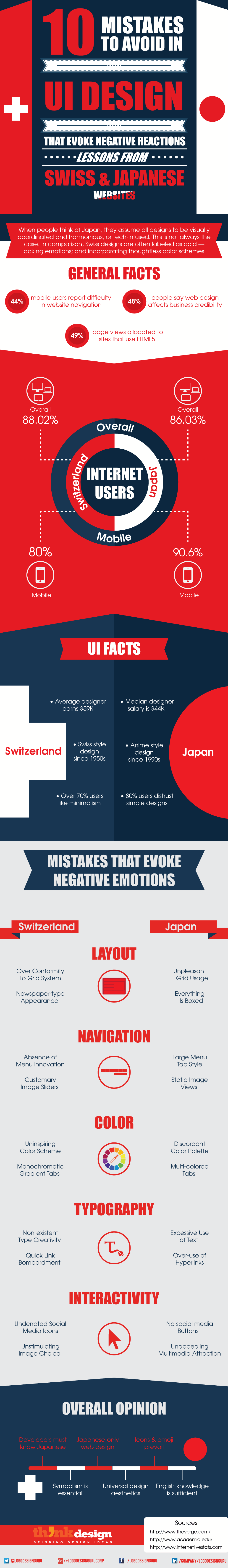
10 Mistakes to Avoid in UI Design that Evoke Negative Reactions: Lessons from Swiss and Japanese Websites
As of January 2015, there are 3 billion internet users around the world. In these 25 years, internet has changed tremendously and has proved to be a major platform for globalization. 80% of USA and Western Europe population has access to the net. Around 60% of East Asia, Eastern Europe and South America population has internet connectivity via various electronic devices.
Considering these facts, it would be apt to say that the internet and the web are keys to our existence in the 21st century and ahead. Thus, seeing evolutions in creativity and technology is not a surprise. Inspiration for emerging designers and entrepreneurs is on the tip of their fingers. However, with all the good things available on the internet, there are things you shouldn’t be influenced by, unless you aim to learn from the mistakes of others.
Despite the many incentives, many websites remain in the pre-millennium epoch or deliver non-functional and unartistic designs. Who can understand a designer’s mind? There are thousands out there with different styles and creative aesthetics.
But before learning to analyze these and isolate them from thousands of websites, you must know what user interface (UI) design is. Why? Web design is an entire industry and within it are parts that make the whole. One of the most important part is UI design because it profoundly affects user experience.
What’s UI?
Rahul Varshney, co-founder of Foster.fm
User interface design evokes emotional reactions; also, it influences peoples’ attitudes towards websites and consequently their actions. Additionally, the “face” of a website determines a brand’s success, loyalty, and sustainability in the market.
The whole idea is to create effective, valuable and meaningful interaction between a website and its users. This process involve creating an equilibrium between operational and visual elements of a website. The UI design you create should be usable plus adaptable to every user’s needs.
This is why, 55% of all corporations conduct online user experience tests. Many from the remaining who don’t, are unable to receive positive reactions from users. Some websites are beyond unacceptable — on a universal scale.
Bad UI detection
So when do you know that a UI design is not a “good catch”? Here are some ways to judge:
- Multi-column layout design
- Fragmented user interface
- Complex logging in method
- Excessive prompt windows
- No smart form filling options
- Visual hierarchy absence
- Too much information disclosure
- Disoriented colors and visuals
These aren’t things that define UI designs which evoke negative emotional reactions but are as crucial as any other mentioned across the web. Other ways to analyze and detect the difference between good and bad UI is to read the ISO 9241 standards that cover human-computer interaction ergonomics. The guide’s scope is vast but is useful for website design.
Having said that, it’s interesting to know that nearly 50% web users cite user interface design as the key factor for deciding business credibility. Even in such a scenario, countless websites produce substandard design interface.
Lessons to Learn
Not only good designs can teach you; trust me, you learn from bad examples as well. Websites such as www.migros.ch, www.roche.com, www.gigazine.net, www.rakuten.co.jp, www.bandai.co.jp etc. are some examples from Japan and Switzerland which have UI designs that you mustn’t aim for.
An important thing to remember is: when it comes to designing website, there’s no gender differentiation. Men and women alike are capable of creating a good or a bad user interface.
In the following infographic I’ve chalked out some of the key lessons that you can learn from Switzerland and Japan website designers, and how they create UI designs which stimulate negative user emotional reactions. This is all you must NOT do!
Did we miss out any? Share with us in the comment below.
Share This:
Embed this Infographic on your site using the html below: