Underestimated Web Design Trends Ideal For Educational Institutions
We are entering a world where nothing is permanent. As a child I was intrigued by the possibility of the world being a virtual reality and everybody convinced me against the idea. But when we look around the world we are living in today, it’s getting more virtual. The dynamic nature of web design industry is another proof of that. However when it comes to the educational institutions and their websites, a lot of them have not yet utilized the futuristic web design trends. What is it that’s holding them back? Continue reading to explore how some college websites are trying to flow with the latest web trends and they are inspiring others.
As we all know design is constantly evolving. It is dynamic, and must adjust to accommodate both form and function. Due to frequent changes in design, it can be a challenge to keep up with the newest design trends especially for college websites that have limited room for experimentation. In an article on web design trends for 2016, we’ve covered the most likely trends that are going to continue but the websites of educational institutions follow very few of them. Let’s take a quick look.

Web design trends undermined in educational institute websites are:
Lengthy Scrolling Sites
We haven’t seen many college websites with a lengthy scroll feature, but that will appear soon. As the research has it, many people would scroll even before the page fully loads. This means you don’t need to place every crucial information at the top of your page. Give space to your readers so that they can read while scrolling. Just because something is at the top doesn’t mean it will be noticed. Even research proves that lengthy scrolling sites increase the chances of visitor engagement and in some cases retention.
“The issue isn’t whether the call to action is visible. The issue is whether your call to action is visible at the point where someone has become convicted to take action.”
The college and university websites are a compact resource that has to display a lot of information for enrolled students as well as new admissions, for the faculty as well as the research groups. Hence the lengthy scrolling sites hold a potential for better engagement in college and university websites where they can strategically devise portions to allocate for news, events, policies and other activities with the institute.
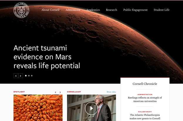
Image Source
Simple Color Scheme
The choice of colors to be displayed on a web layout is crucial and it directly affects the retention of visitors to a website. Sometimes a simple but wrong choice of color restricts visitor’s attention leading to increased bounce rates. The complexity of color combinations is always seen to affect user retention. Owing to this problem, a web design trend has emerged lately in which websites chose a small color palette restricting the colors to 2 or 3.
They then incorporate the chosen colors in the entire design. the idea is to make the web design more lucid and enhance clarity so that the reader is not confused by the color jumble or the clutter and their attention is drawn to particular areas of the page (let’s say the signup button). Let’s find out how the University of Texas fits into the model.
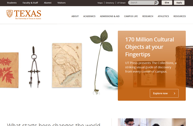
Image Source
Note the two prominent colors in this website are derived from the same side of the spectrum yet they complement each other. Besides that, it has ample whitespace in the background that draws the visitor’s attention to the right places. Now let’s take a different example where the color palette comprises of cyan, blue and mustard yellow and they remain consistent throughout the layout. Note these colleges are following this trend, but it still remains unexplored by most educational institutions.
Image Source
Smart Navigation
What is common in most college websites? It’s that same old monotonous menu bar displayed at the top of the page. It is attention grabbing, but a new visitor wants to learn more before clicking. Finally there is someone who’s breaking conventional standards in both academics and web design elements. Check out how Johns Hopkins University squeezes the whole menu bar into a smart looking button that is pushed to the left corner. In the center, the visitor enjoys a real taste of minimalism with motion graphics playing in a wide screen.
They have implemented quite a few web design trends that contribute to an exceptional user experience. They focus on an effective user experience with convenient scrolling, less text and interactive diagrams that are self-guiding.
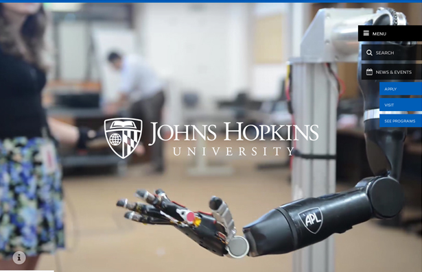
Image Source
In-Your-Face Typography
Listen up everyone: Arial-Georgia-Verdana-Times New Roman are no longer the ruling font currency on the web. We have been liberated from their stranglehold all thanks to the wide range of web fonts. Designers today have the option of working with a wide variety of fonts, which has spurred tremendous innovation in typography. The choice of typography affects visibility, page structure and content hierarchy. University of Virginia uses a font that pops out upon hovering. The text is not just crisp and vibrant but short and precise giving out exactly what the user is looking for.
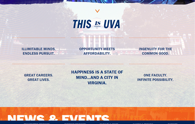
Image Source
Carousel Narrating The Story
As humans, we love living in a land of make-believe. We read novels, watch movies and plays. Even sporting events can unfold as narratives. Usually a college website is not complete without presenting its college life. It could be a virtual tour or an image-based carousel narrating the life at the campus. Some edu. Websites present their slideshows and them the center of attention to attract prospective students. They can catch a glimpse of the university life without ever visiting the college. Worchester uses a rotating carousel that displays basic info without too much text. This carousel based layout in the header is fully responsive.
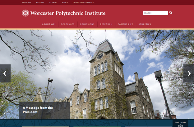
Image Source
University of Wisconsin is more creative with this idea by showcasing the terrace area which is an outdoor location for lakeside movies and music for the students.
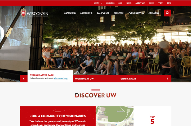
Image Source
Centered Content
More websites developers are adapting the powerful style that is achieved from centered content usually prevalent as a trend in home pages. The message to be communicated appears right in the center position which is the first place where a visitor’s eye automatically falls. Usually, this trend becomes even more pronounced with minimal text and good visual effects. It further leads to clarity of content hierarchies. Centrally aligned home page orientation is becoming popular but very few educational websites apply this trend. University of Illinois places their Logo in the center unlike most websites that place it on the left. As we scroll down the home page, the text appears more centrally aligned despite the fact that this is an example of a hybrid of centered and split content. Take a look.
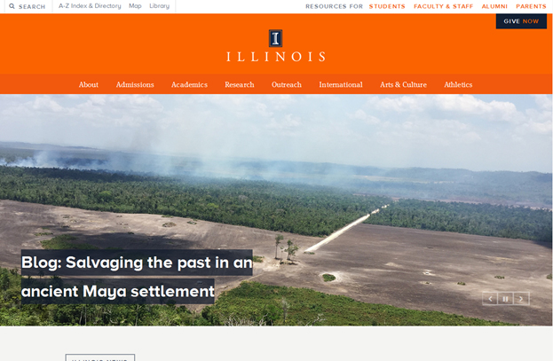
Image Source
Creative Grid Design
In graphic design, a grid is a structure (usually two-dimensional) made up of a series of intersecting straight (vertical, horizontal, and angular) or curved guide lines used to structure content. Some grid systems specify fixed-width elements with pixels, and some are ‘fluid’, meaning that they call for page element sizing to be in relative units like percentages, rather than absolute units like pixels or points.
A creative grid design is more fluid and hence meets the criterion for a responsive web layout. Many college and university websites have already applied this approach in the web layout. Take Yale University for example, what type of grid do you see?
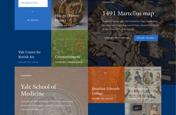
Image Source
Compare this grid design to a simpler layout that just stacks crucial information neatly into organized and proportionate blocks. Which one is a more creative layout?
Image Source
Prominent Icons
EDU websites are focusing on becoming responsive to enrich user experience. They are on their way to customize usability and create accessibility apps for registered students where they can check their progress in terms of semesters attended, cumulative GPA, courses completed and much more. Now when they are expecting their users to be on mobile. To facilitate user experience on hand-held devices, the web designers and developers are working to simplify navigation by creating prominent icons for CTA buttons. Some might consider creating an App-like menu design, while others would just integrate icons like the University of Washington has done.
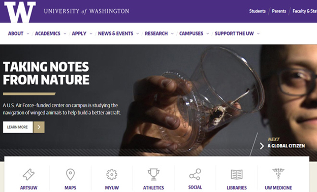
Image Source
Note how the choice of icons communicates the message in brevity. Well it is not always this simple to categorize information that visitors are interested to know. Here’s a little more complicated way of
Image Source
Resources
https://en.wikipedia.org
http://www.myloudspeaker.ca
https://nces.ed.gov
Embed this Infographic on your site using the html below:
Education Institute Logos
College Logos
Academic Logos
Catholic Logos
Vocational School Logos
Daycare Logos
Learning Center Logos