What I think When I See The New Netflix Logo
Feature Image Vector Source: Freepik
The cool thing about letter marks and symbols is that they can mean anything to anyone. For some, the Pepsi symbol is a smiley face, while others see a guy with a huge belly. There are endless possibilities to connote a visual; it only depends on your eye.
Do you remember the time we went crazy over optical illusions and negative space? Ahem, we still are. At least I am constantly trying to askew my eyes to see what more can I find in a logo design. I continually read articles on ‘the hidden meanings in logo designs’. What to do, they’re fun. I’m sure you like them too.
Love At First Sight
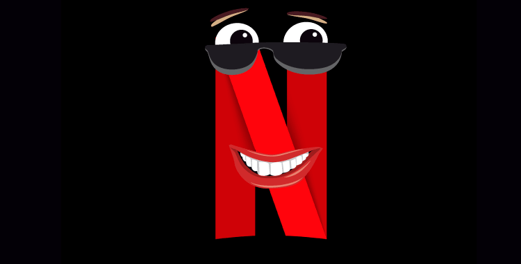
So just like a usual day, I was exploring stuff on the internet when I saw the new Netflix logo. You know what came to my mind in the first second. Ribbon!

Image source: Netflix
A ribbon that you can find on several vector websites, such as Freepik. A ribbon, which adorns a father’s day gift or one that’s used for social media images as a banner.
Second Thoughts
When I looked longer, I wondered what’s special about this logo design. To be honest, any amateur graphic designer can make a replica in under 5 minutes. Seriously Netflix?
Before anyone says anything, I tried it out. I’m not awesome at Adobe Illustrator but I gave it a go.

I spent only 2 to 3 minutes. I know, I can work more on the shadow, but there are just 4 steps:
- Make the rectangles with a bent edge on top
- Compose them to look like the letter “N”
- Adjust the colors. The shapes at the back are darker.
- Add shadow using a shape in black with a Gaussian Blur.
What Else There’s To See
Okay so, I was thinking what I could talk about on the new logo of Netflix app. And I placed the logo in the design software and simply stared at it. Then, all of a sudden all this came to my mind…
And I translated it visually.
Double, double toil and trouble!

I scream, you scream, we all scream ICECREAM!

Haya! You’re finished.

Do you have more ideas? Share with me. I’d love to look at them.
Write Update 6 Feb 2019
Did you hear? Netflix rendered a new logo animation and it is not up to the mark. It is, well, like the logo it designed earlier: pretty mediocre but yes, much more colorful. Brands are investing in “moving logos” now, but production house logos always had to be animated logo designs as they were on screen before the movie started.
The new Netflix logo animation will be seen before the Netflix Originals. The concept behind this is the new identity this streaming service brand wants: to be a production studio. The letter “N” disintegrates into a vertical spectrum of colors.
Let’s explore what people have said about their new look.
Shapes and colours the likes of which I’ve never seen before! pic.twitter.com/HUmwAzlskM
— Andrew Francomb (@francoberry) February 1, 2019
Me, looking at the new @netflix logo for their originals… pic.twitter.com/7MzZG2K4Z1
— EctoBurger (@EctoBurger) February 2, 2019
Reminds me of the old HBO intros : pic.twitter.com/ML2UFsHo99
— Christina (@ctinaxo) February 1, 2019
Designing a company logo design is a challenging yet rewarding exercise if done right. A lot of thought process goes into it and the client plus the designer has to make sure that the logo is unique and attractive.
What is your verdict on the new Netflix logo animation?