Will MasterCard’s New Logo See Another Dawn?

Or will it be pulled back just like the one released in 2006 that went through some serious bashing? Only time would time would tell how this new logo pans out. From the looks, we can say it’s here to stay but judging from the logo redesign history of MasterCard, we can never really be certain about its future.
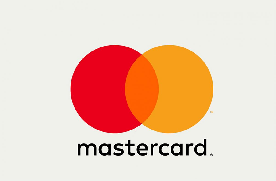
Image Source: Mastercard Brand Center
Mastercard has a history of hitting the news for the oddest reasons. This time around, their approach to rebranding was to keep things simple. This new logo and brand identity was designed by New York-based Pentagram partner Michael Bierut and team.
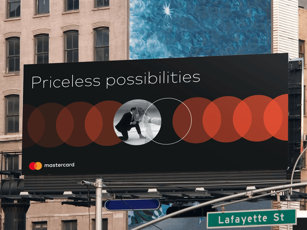
Image Source: UnderConsideration/Brand New
Tracing back to their inception and subtle redesigns along the way, its worth-noting that they never gave up the color palettes nor did the mess with their symbol. Take a look at their logo evolution.
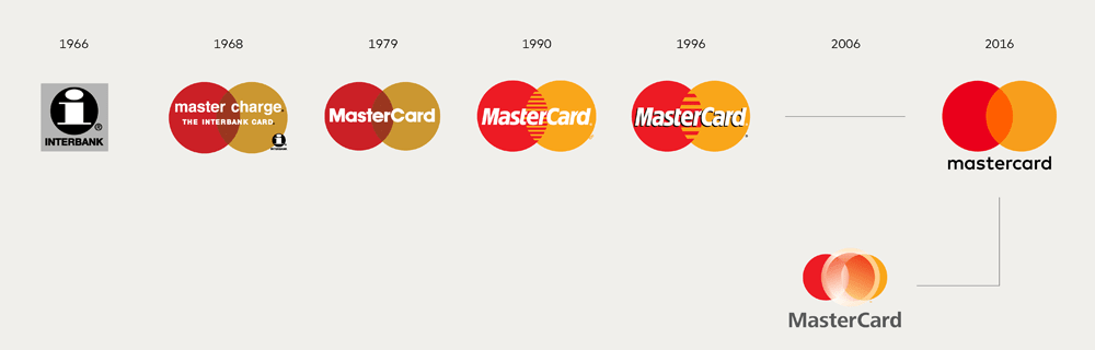
Image Source: UnderConsideration/Brand New
Now if you would recall, their previous logo redesign was criticized to an extent that they never used the redesigned logo on their debit and credit cards. They claim to have introduced 3 circles that according to the company reflects the company’s unique, three-tiered business model as a franchisor, processor and advisor. Upon taking a closer look, you will notice more than 3 circles. Also they failed to explain why the gradient laden white circle is larger than the other two circles and unevenly skewed towards the right.
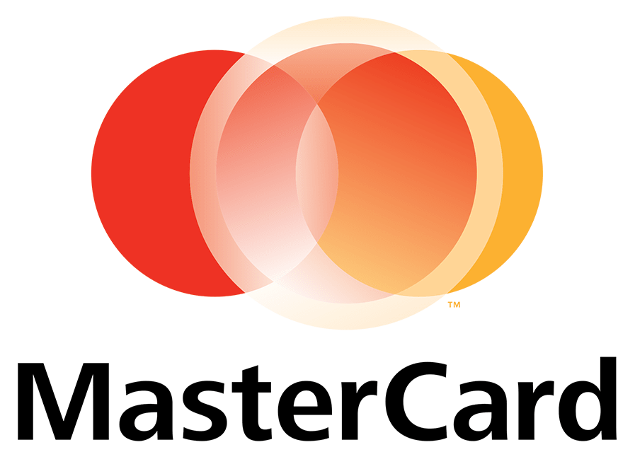
Image Source: goodlogo!com/MasterCard 2006
A new beginning
After the release of its new logo, the brand is receiving mixed reviews where some critics are appreciating the minimal design while others claim it to be a simple venn diagram because the stripes that previously appeared in the area of intersection of the two circles is eliminated. Note that they have not changed the color palette but the typeface undergoes some experimentation but it’s made it trendier. The wordmark is in lowercase and totally isolated from the symbol.
It seems like a simple redesign is all it takes to make it look impressive. Take a look at the before and after logos placed side by side.

The logo has always featured two circles overlapping each other to signify a promise of connectivity and bonding. With this recent attempt to rebrand, do you think MasterCard has entered the league of but iconic logos? Check out the examples of popular logos with a similar geometric predisposition.
Chanel – the iconic broken links
An iconic fashion logo that features an excellent execution of interlocking circles. A popular story suggests that it was inspired by the original Château de Cremat logo; a pair of intertwined Cs. Note how the two “Cs” are forming incomplete circles and overlapping each other in the middle.
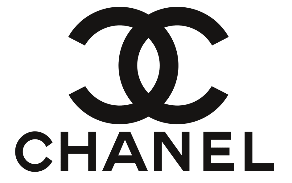
Image Source: Google Images
Audi – multiple interlocking rings
The Audi symbol is four ceiling rings that reflect the four manufacturers of Auto Union. The initial ring from at the left side represents Audi, the next represents DKW, the third is Horch, then the fourth ring is Wanderer. The symbolism behind the 4 overlapping were filled with 4 company logos that were eventually given up for a more modern and urbane symbol. With every modification, the logo became more sophisticated.
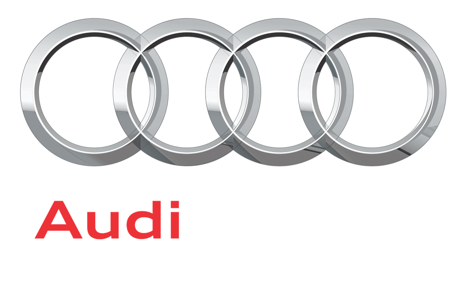
Image Source: Google Images
Gucci – the interlocking “Gs”
On the list of most memorable logos, Gucci has an evergreen logo that will always top the list. Instead of the interlocking “Cs”, this one has interlocking “Gs”. While undoubtedly similar to that of Coco Chanel, there has never been any public litigation regarding their likenesses. The two are equally symbolic despite bearing some resemblance.
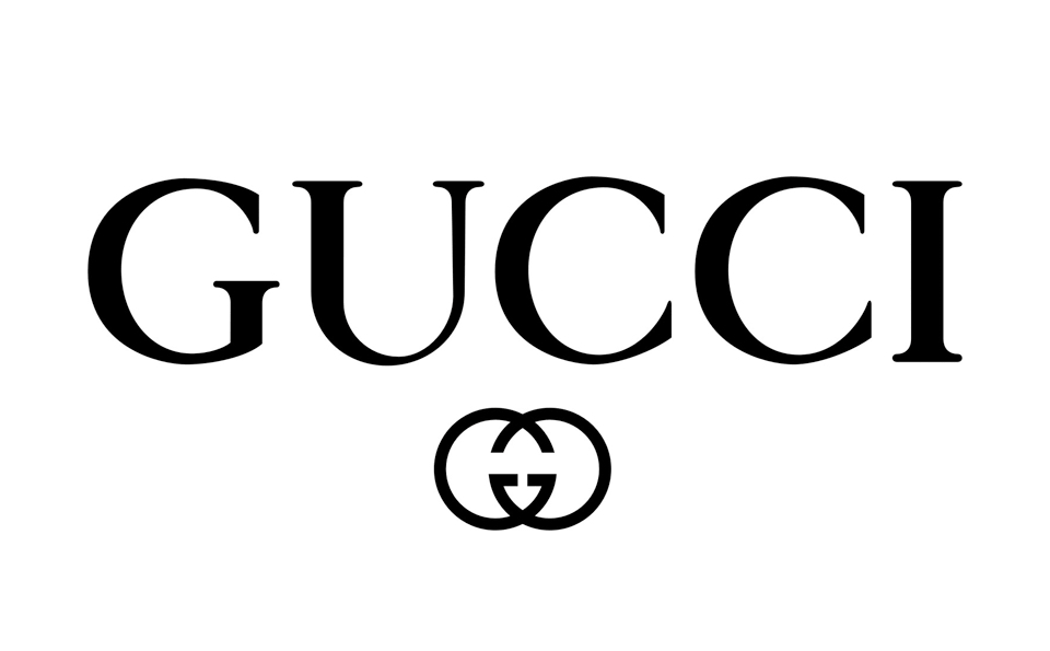
Image Source: Google Images
Toyota – symbolic steering wheel
This iconic logo has two interlocking ellipses instead of two circles. The two inner, perpendicular ellipses symbolize the merging of the hearts of customers and the company. The most obvious shape that can be seen in the badge is the letter “o” but every other letter is hidden in there. Can you find them? Here take a look.

The verdict
The MasterCard’s new logo looks good in branding but how long will it last? It’s been criticized for being too simple. So does it runs the risk of getting rejected sooner or later for being clichéd? The company was fully aware of the brand equity built over the years by the previous logo identity which explains why they were not ready to deviate the logo from the previous color palette and the circles. In the new logo, the word is outside the circles. This change makes the mark more flexible for use in any platform. Note the logos shown above for comparison are truly iconic because they don’t need a redesign every 5 or 10 years irrespective of the trends. Has Master Card finally entered the league of truly iconic logos? Share your thoughts.